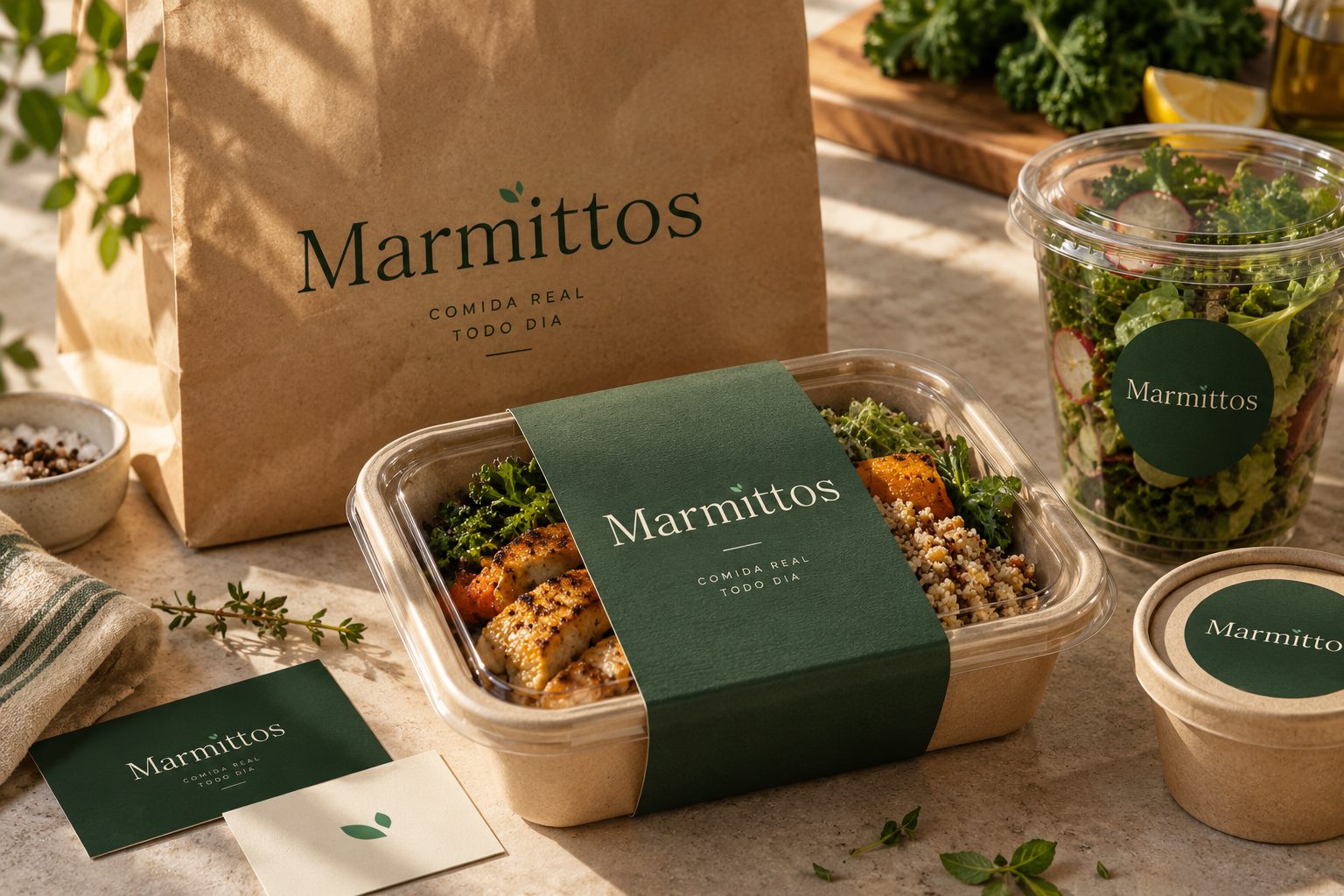
Marmittos
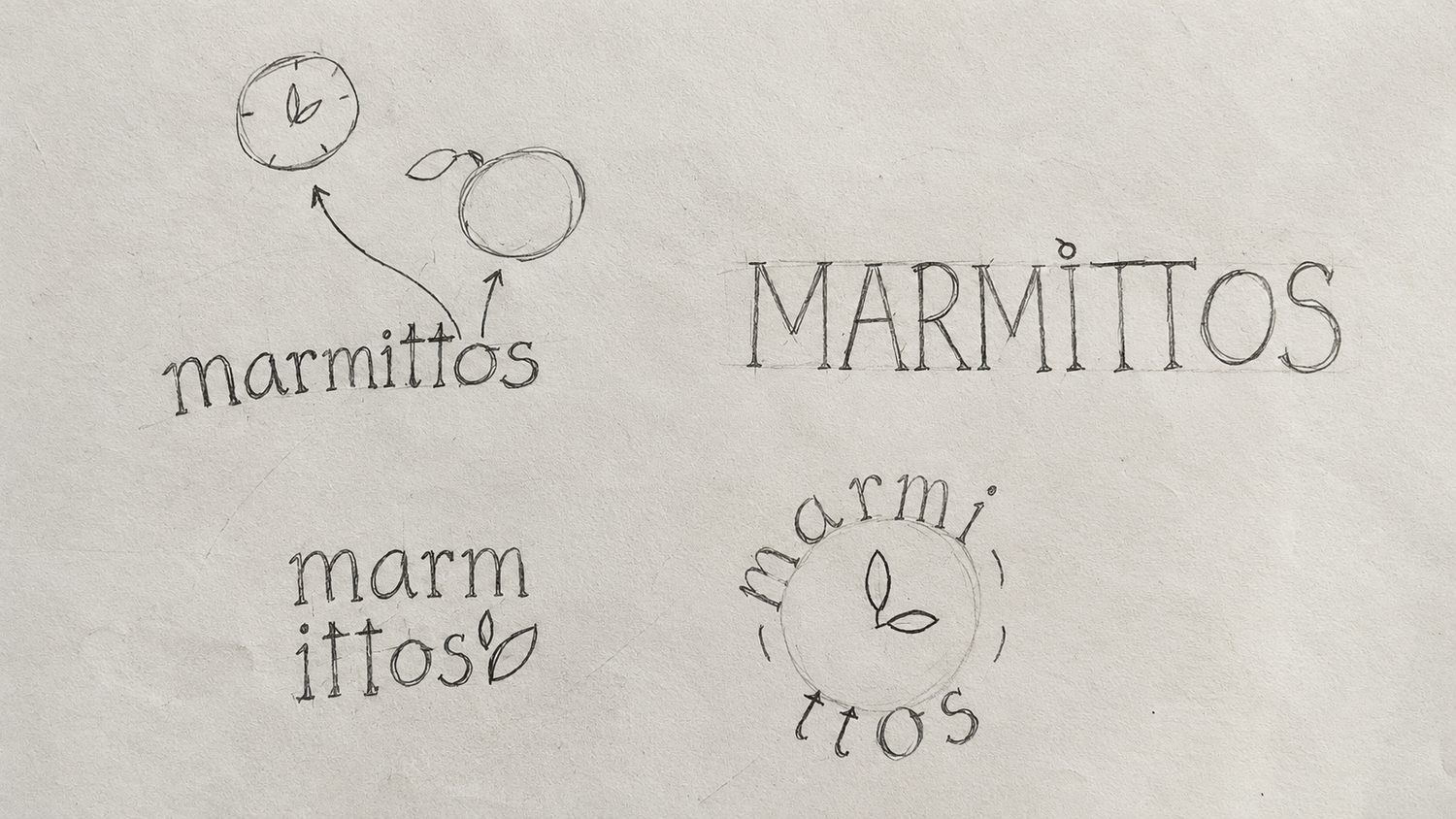
Marmittos is a healthy meal subscription concept created for people who want to eat well without spending time shopping for ingredients or cooking. The visual challenge was to communicate elegance, quality, and convenience while making it clear that the convenience comes from real food rather than an industrialized fast-food experience. I developed a nature-inspired identity grounded in earthy greens, restrained neutrals, organic details, and typography that evokes traditional food preparation. Hand-drawn logo exploration and responsive variations supported a recognizable visual system across packaging and digital content. The project also considers how consistent brand touchpoints and a clear promise of time saved could support customer experience and brand recall.
View Case Study – Marmittos →


03 / Selected Work
Social Media & Content Design
Digital content shaped by brand positioning, thoughtful art direction, and clear visual storytelling.
Social Media Design · Art Direction · Luxury Brand Communication
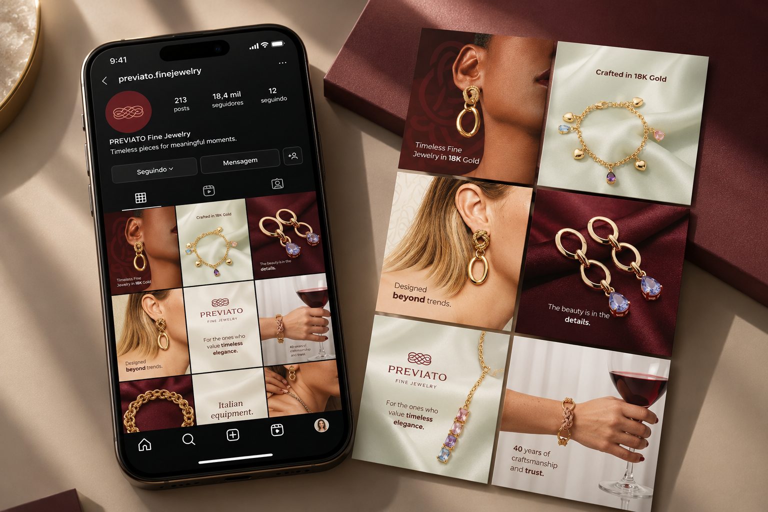
Previato Fine Jewelry
During a rebranding initiative for a US-based jewelry brand, I developed the visual direction for its digital communication. The objective was to express product quality, elegance, and mature femininity without relying on crowded compositions or promotional-looking branding. I intentionally photographed or presented the jewelry against softly folded silk: the material, sheen, and wave-like movement were selected to evoke delicacy and refinement while drawing attention to the pieces. Copy was kept sparse to create a quiet, editorial tone, and the logo appeared selectively or was integrated subtly into the layout. Inspired by the principles of quiet luxury, the approach uses visual restraint to make the products—not repeated brand marks—the center of attention.
View Case Study – Previato Fine Jewelry →Editorial Design · Social Media Design · Visual Consistency
Facta
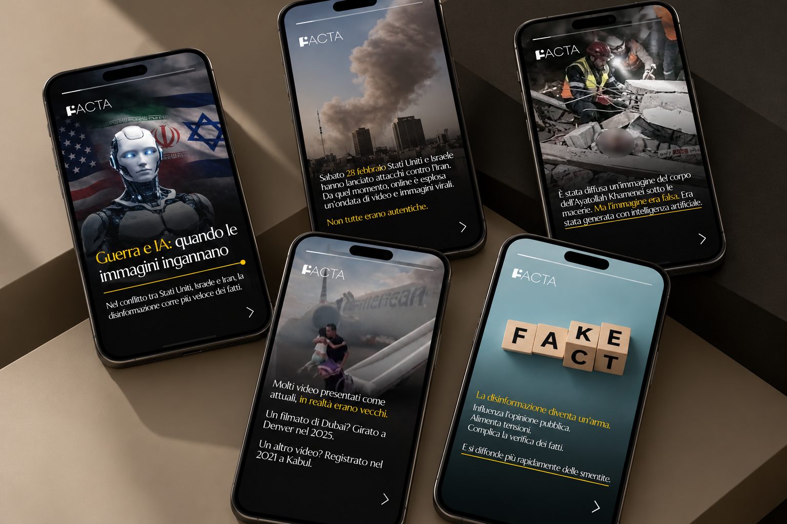
Facta is an Italian digital publication that identifies and debunks misinformation. Although its social media content already used the brand’s black-and-yellow palette, it lacked recurring graphic elements and a consistent editorial language. Rather than proposing an unnecessary full rebrand, I worked from the existing identity: I retained the established colors, introduced a circular graphic motif inspired by the dot within the F of the logo, and selected typography that complemented the original mark. The resulting content system was designed to bring visual continuity to posts on complex topics while making information hierarchy and readability central to the communication.
View Case Study – Facta →Social Media Design · Personal Brand Communication · Visual Storytelling
Ana Magalhães
Ana Magalhães is an immigration legal consultant whose Instagram communication needed to feel credible without losing the warmth of a personal profile. I worked with her existing colors while making them visually compatible with the burgundy used by her partner company, Kravitz & Guerra. Serif typography brought an editorial, professional tone; real photographs, particularly those connected to Ana’s own experience of living in the United States, helped humanize the content. The strategic narrative went beyond explaining immigration services: the profile was designed to speak to the aspiration behind those services—the possibility of building a life in America. This balance of professional trust and personal storytelling guided the visual decisions throughout the project.
View Case Study – Ana Magalhães →