Brand Identity · Case Study
Marmittos
Introduction / Overview
Marmittos is a healthy meal subscription concept created for people who want to eat well without spending time shopping for ingredients or cooking. The visual challenge was to communicate elegance, quality, and convenience while making it clear that the convenience comes from real food rather than an industrialized
fast-food experience. I developed a nature-inspired identity grounded in earthy greens, restrained neutrals, organic details, and typography that evokes traditional food preparation. Hand-drawn logo exploration and responsive variations supported a recognizable visual system across packaging and digital content. The project also considers how consistent brand touchpoints and a clear promise of time saved could support customer experience and brand recall. Context & communication objective
Marmittos was conceived as a subscription program delivering healthy, practical prepared meals. Its value proposition combines the quality of real ingredients with time saved on shopping and cooking. The brand therefore needed to communicate three attributes together: elegance, quality, and practicality. The aim was not to imitate the familiar visual codes of fast food, but to suggest that convenience can coexist with nutritious, thoughtfully prepared meals.
Research & strategic direction
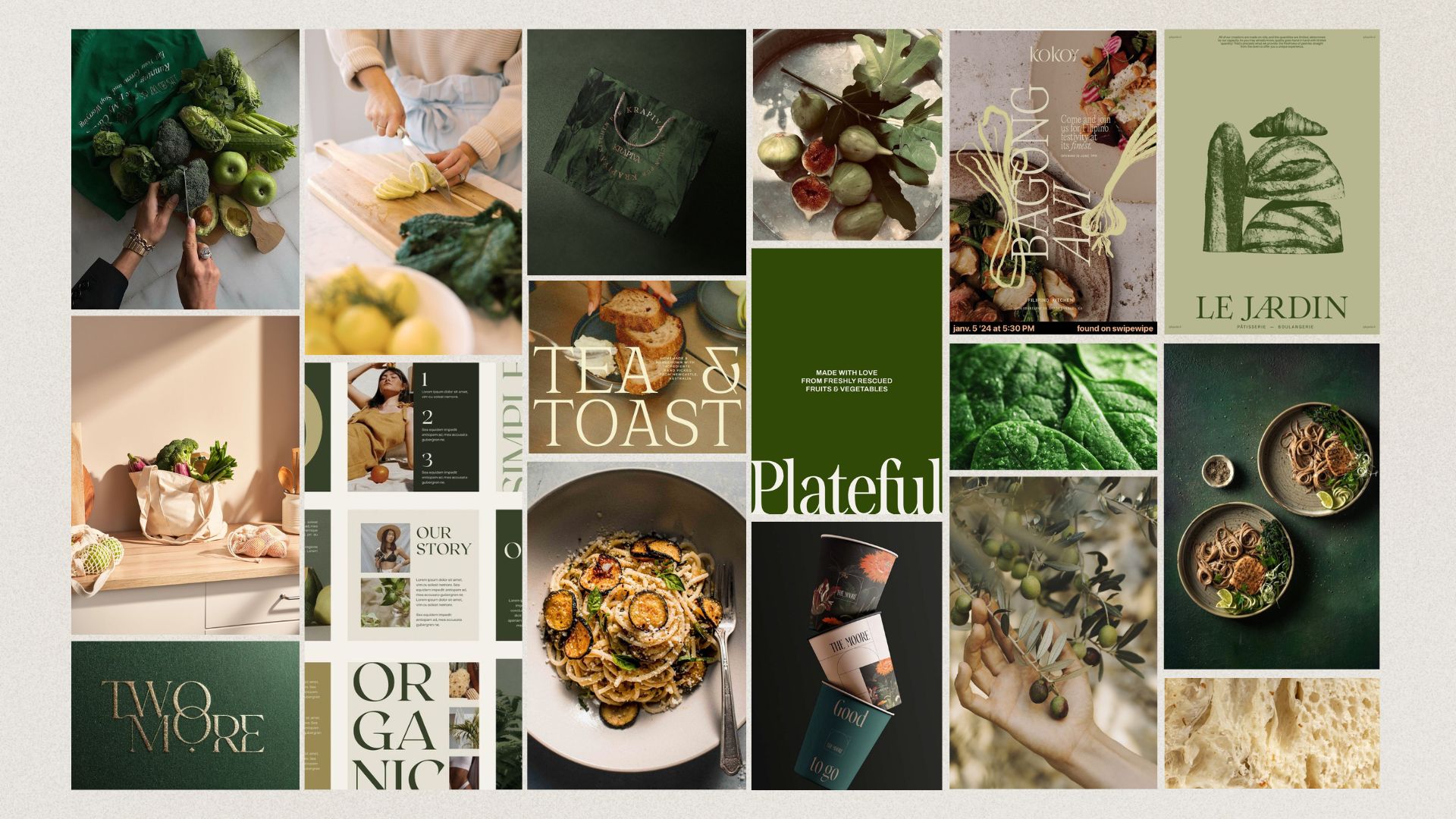
My process began with a briefing, definition of communication objectives, and research into the market and competing brands. The project explored how saturated colors often used in the food category could be contrasted with a calmer visual direction. I wanted the identity to suggest ingredients that come from the earth and a lifestyle in which caring about food quality does not require personally doing every step of food preparation.
Creative concept & design decisions
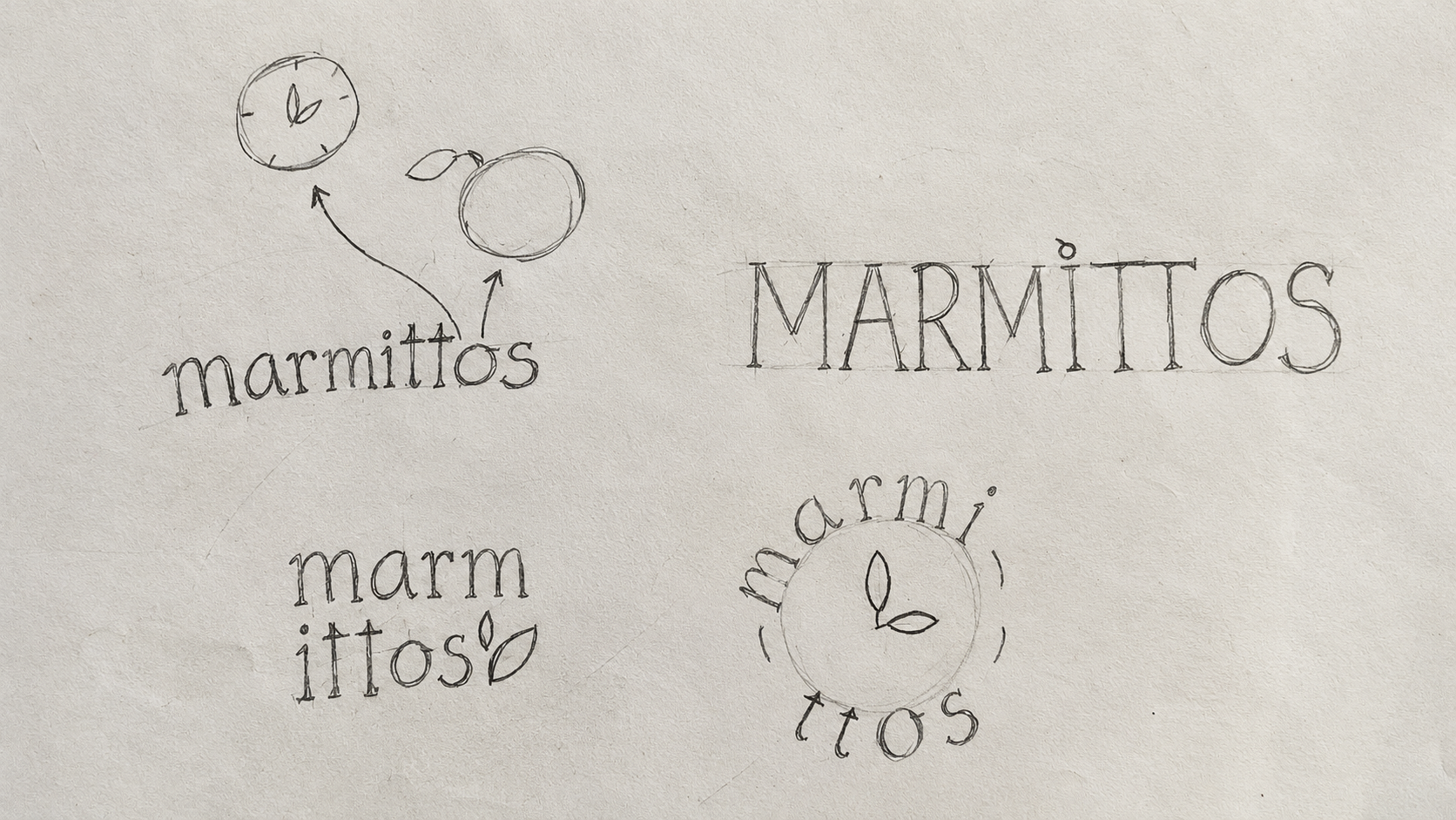
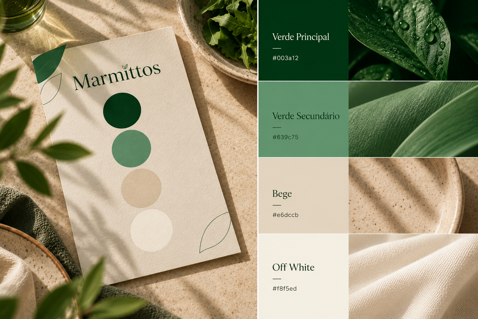
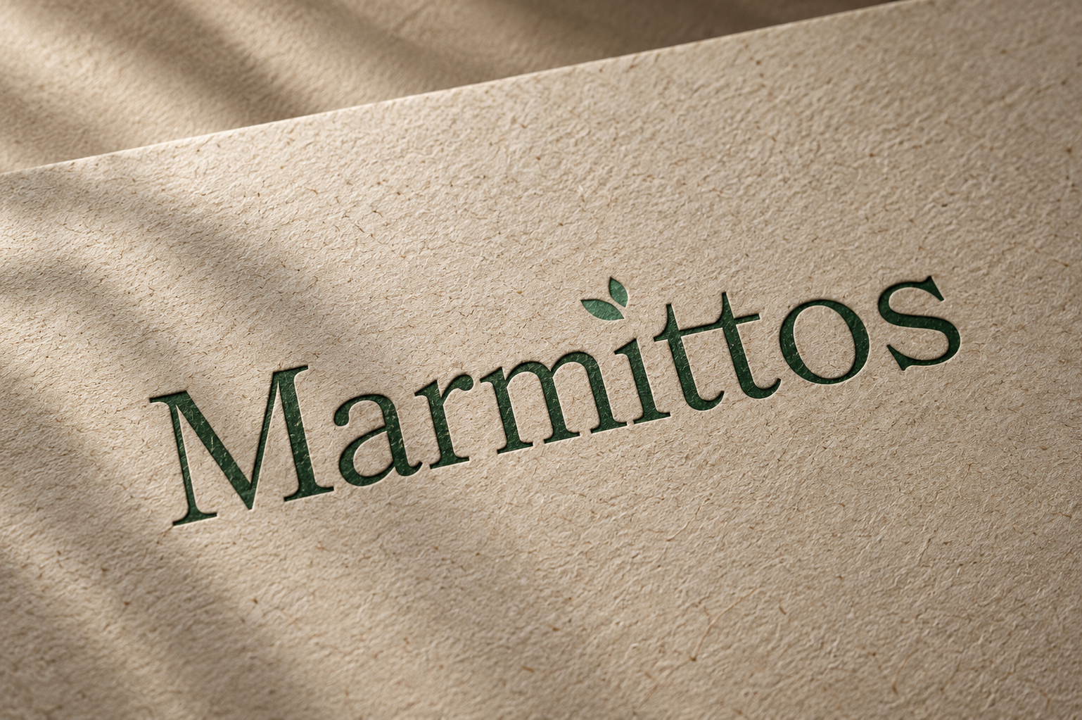
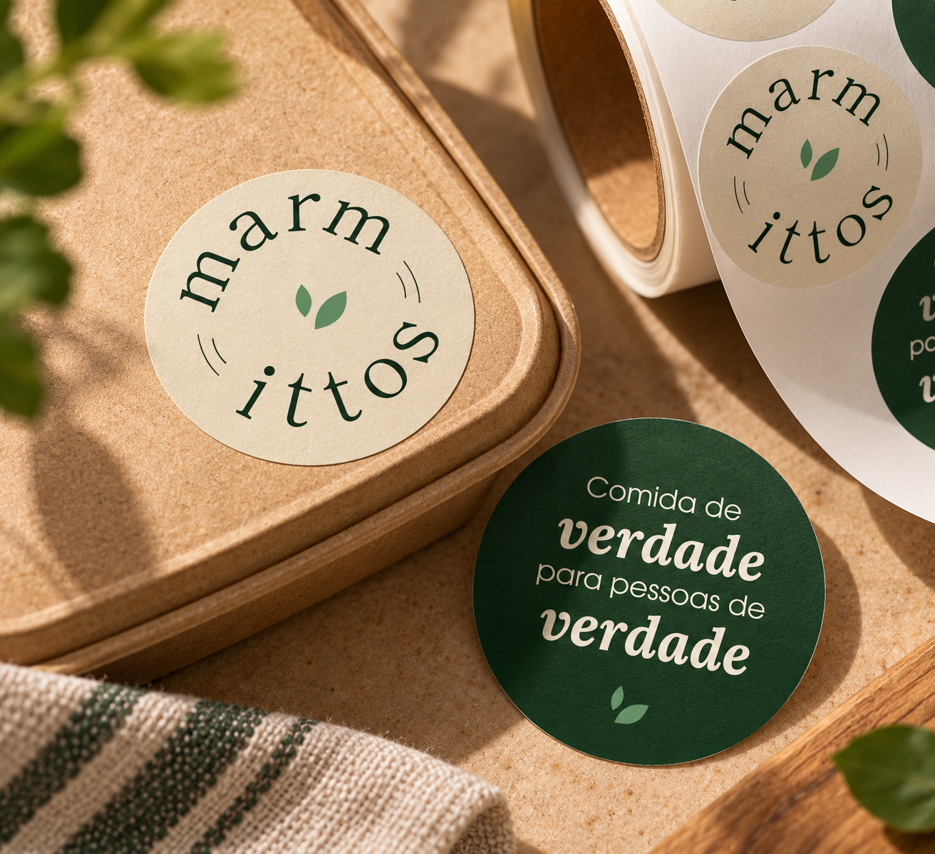
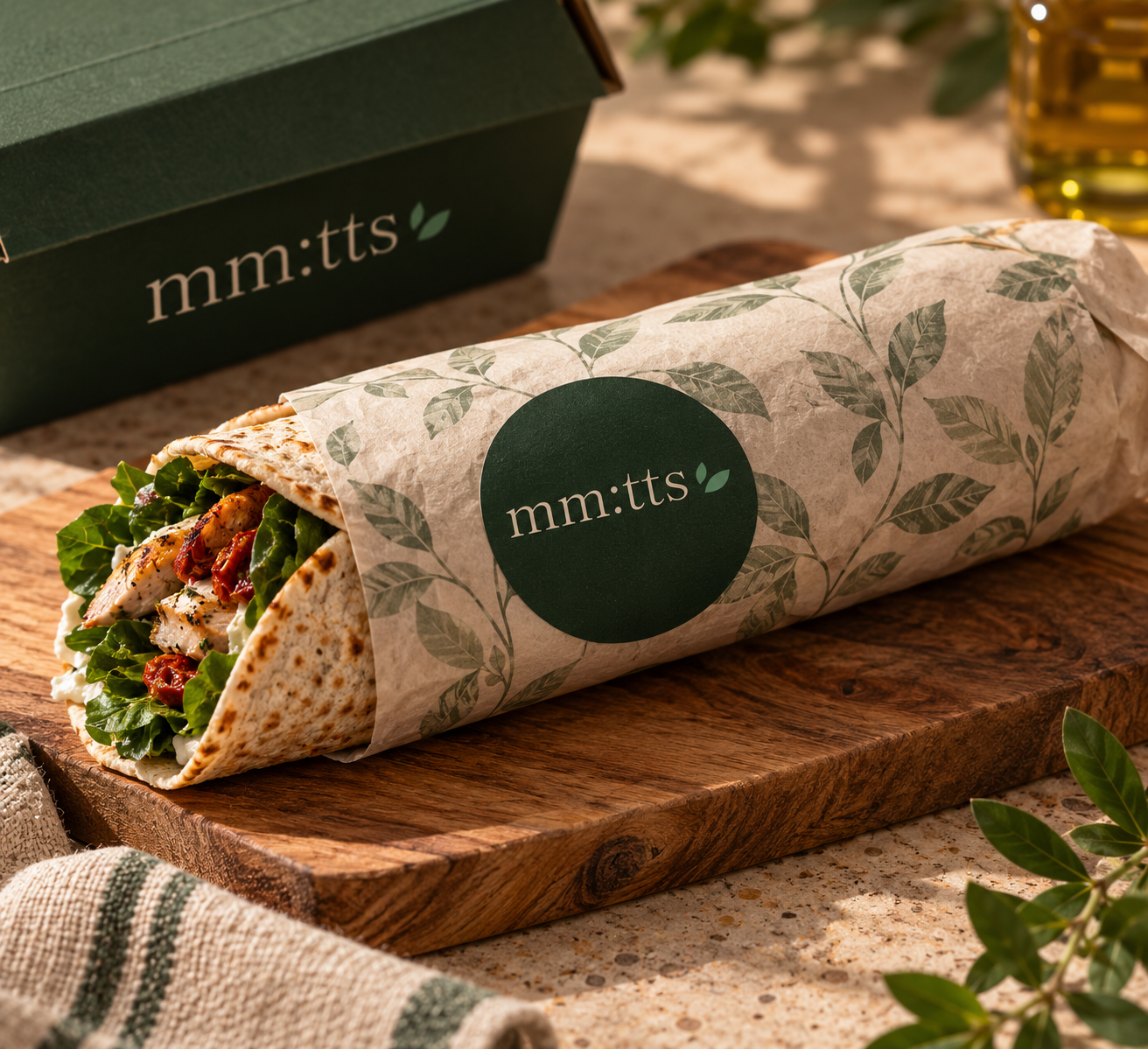
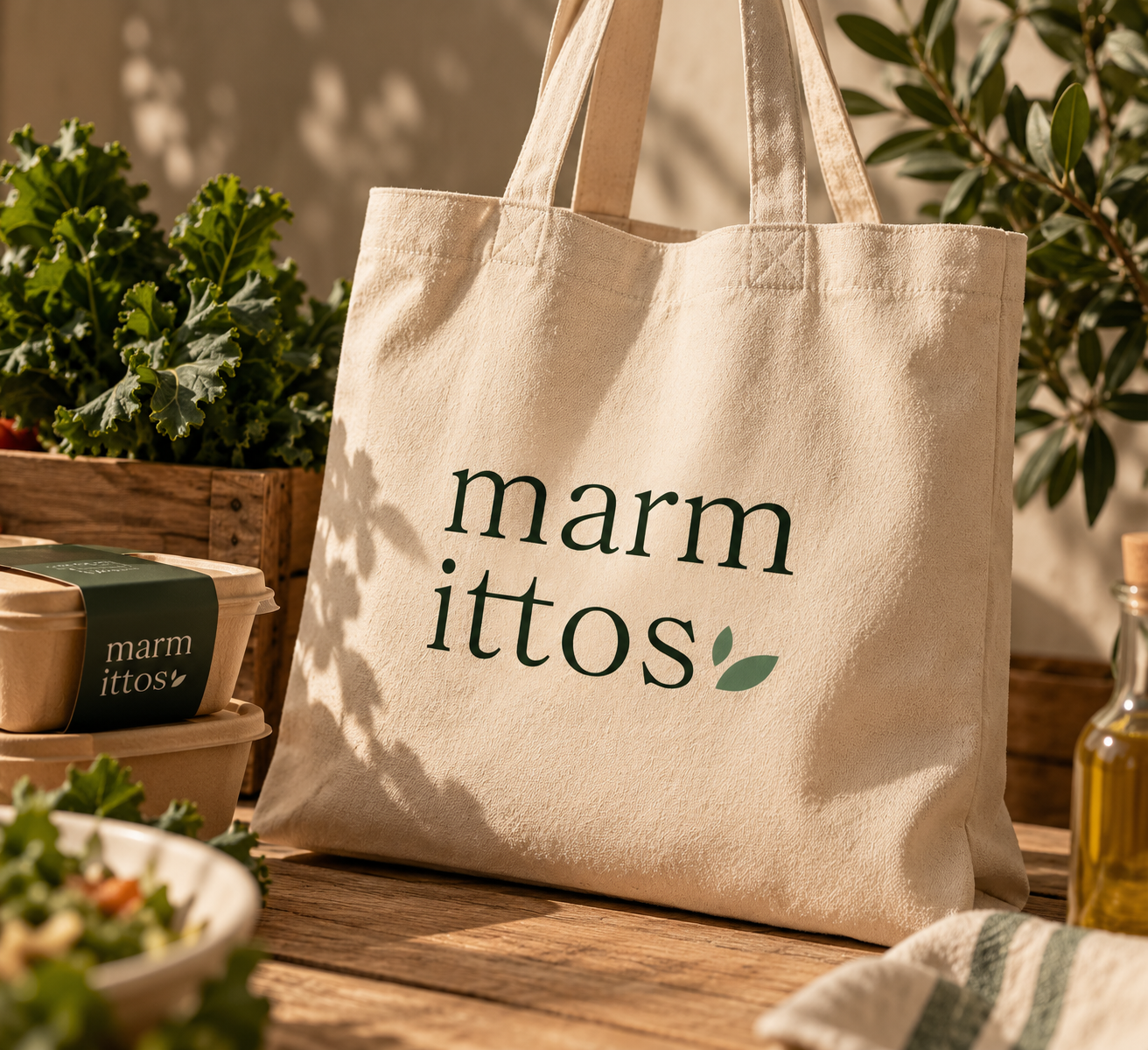
The palette draws on greens and soft neutral tones to reference freshness, organic ingredients, and the natural world. The typography was selected to suggest a traditional, carefully made quality: the feeling of real food and slower processes rather than an industrialized product. That tactile, understated direction was central to the concept, comparable to the natural character of raw linen. The logo was first explored through sketches on paper before being developed digitally. Time was also an important brand differentiator, and the project considered it during logo development and the creation of responsive logo versions. Those responsive versions make the system adaptable; the practical time-saving promise itself is communicated through the broader brand narrative, rather than proven by a logo.
Applications & strategic considerations
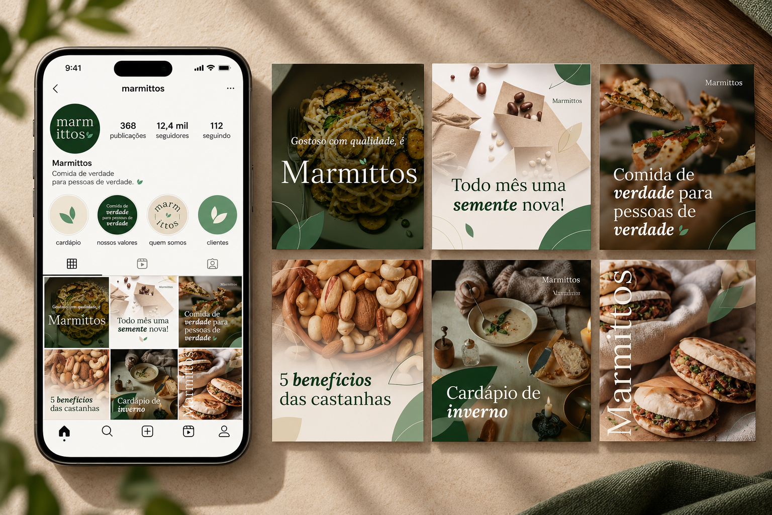
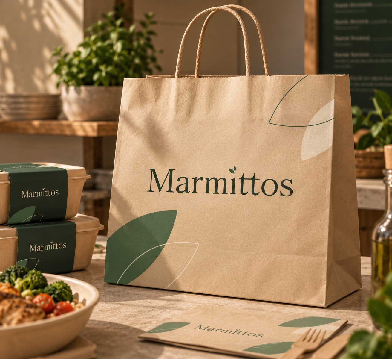
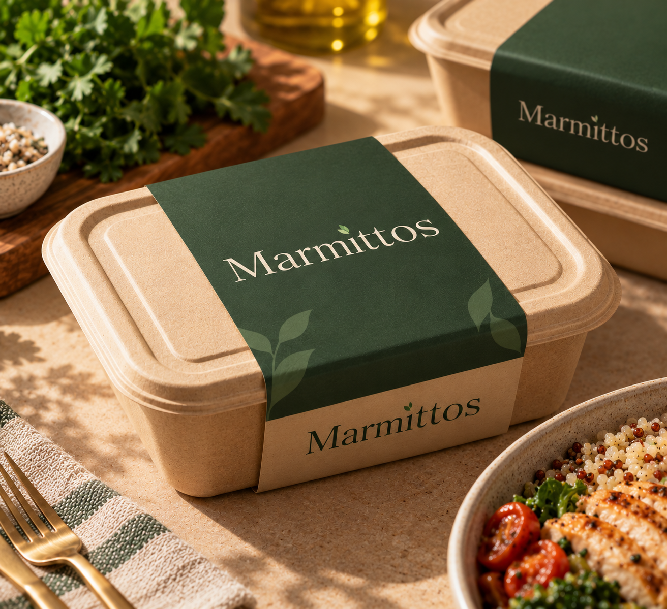
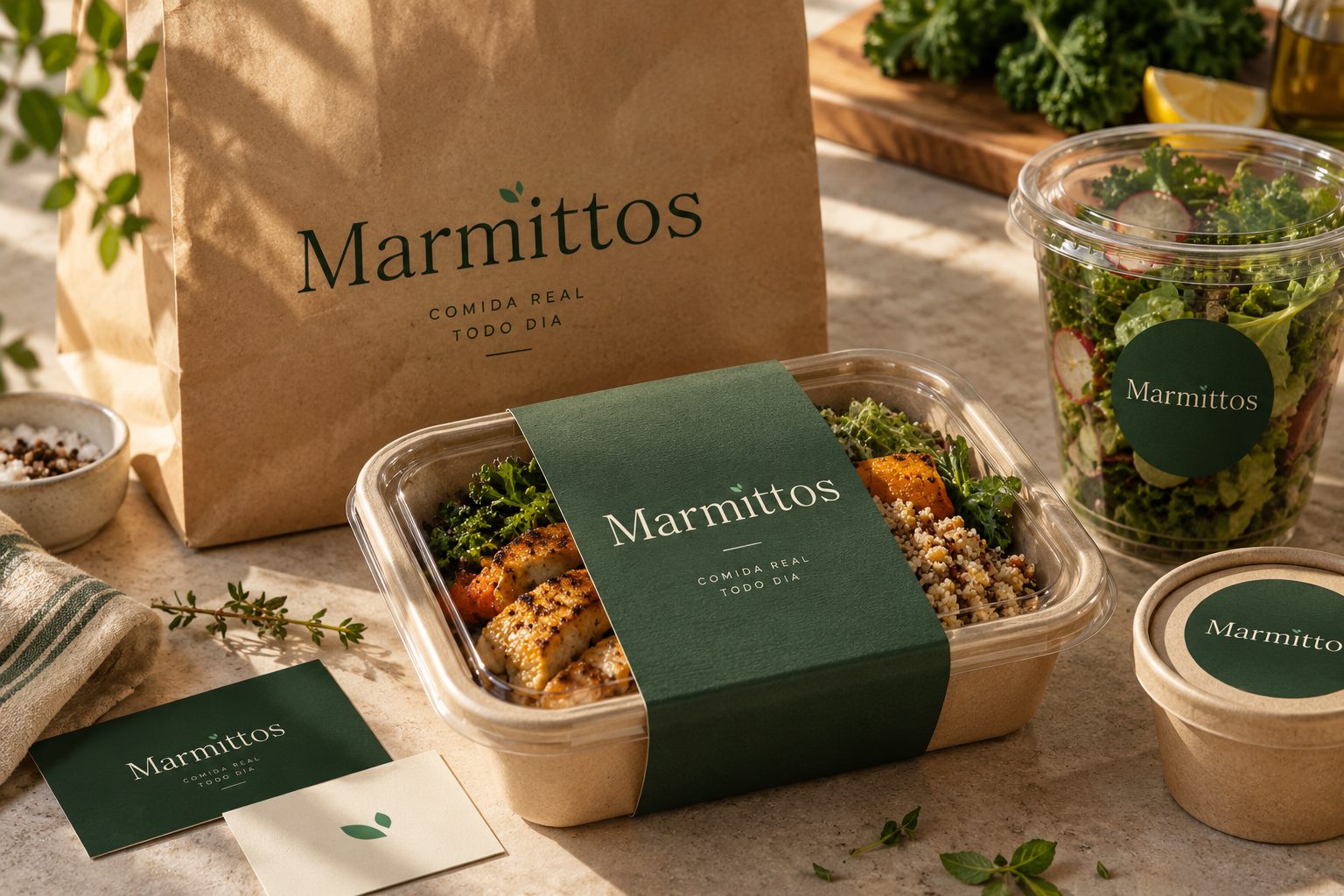
The identity was applied to packaging, branded items, and social media graphics. The digital compositions continued the same visual language, allowing the idea of real food to remain recognizable across formats. At the end of the project, I proposed ways that cohesive touchpoints, customer experience, and recurring communication could strengthen recognition and encourage loyalty. These are design recommendations and intended effects, not measured business results.
Visual archive / 10
Process & applications