Brand Identity · Case Study
Little Luna Pet Store
Introduction / Overview
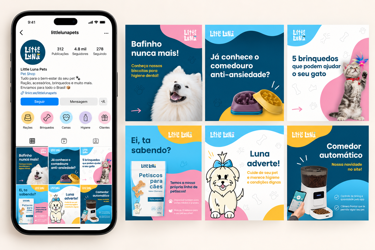
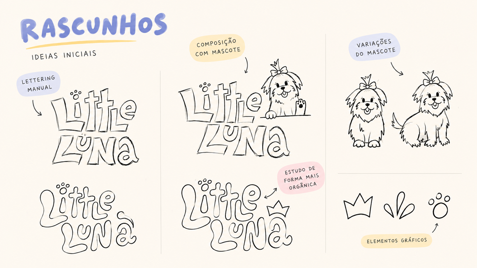
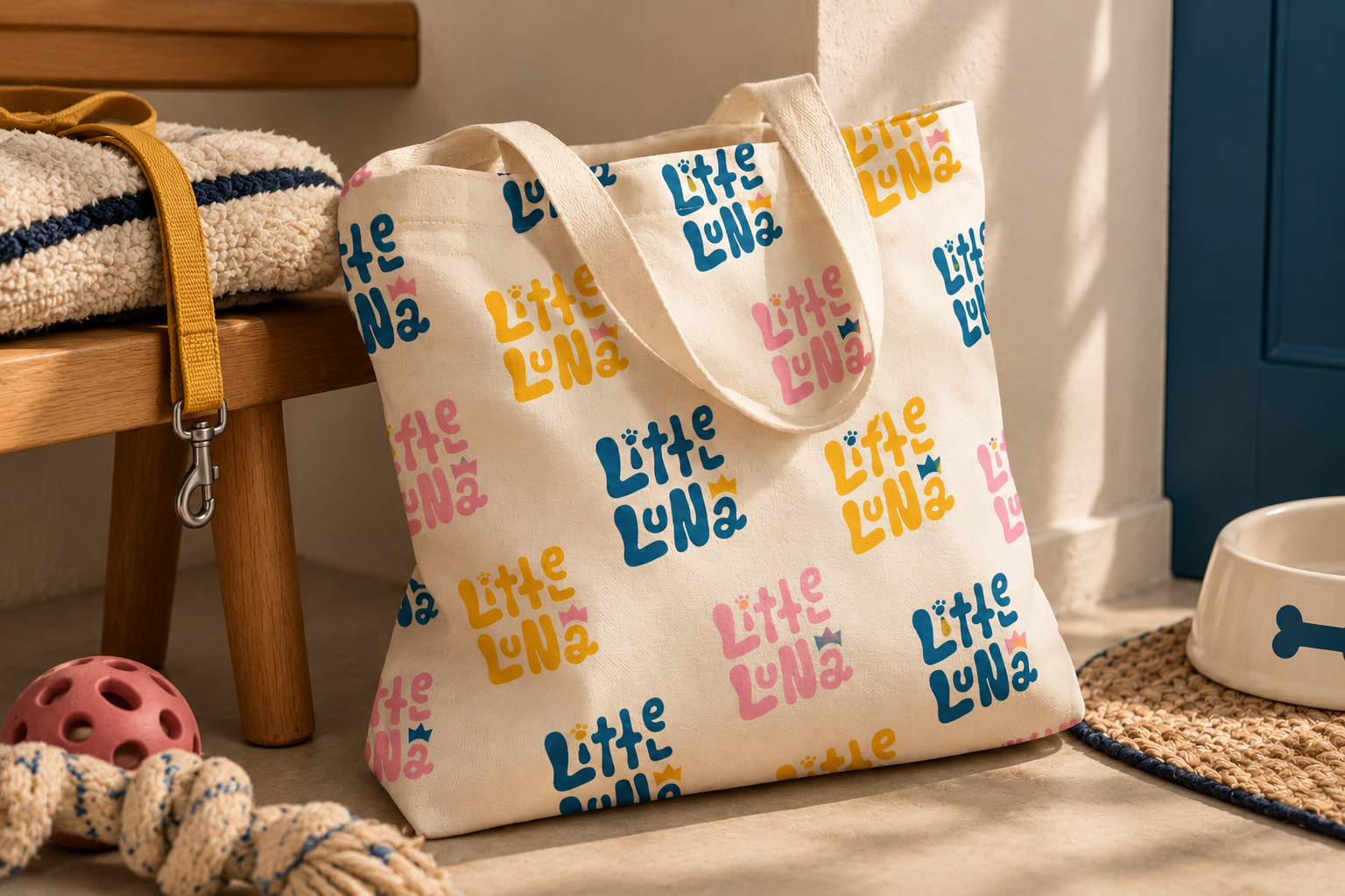
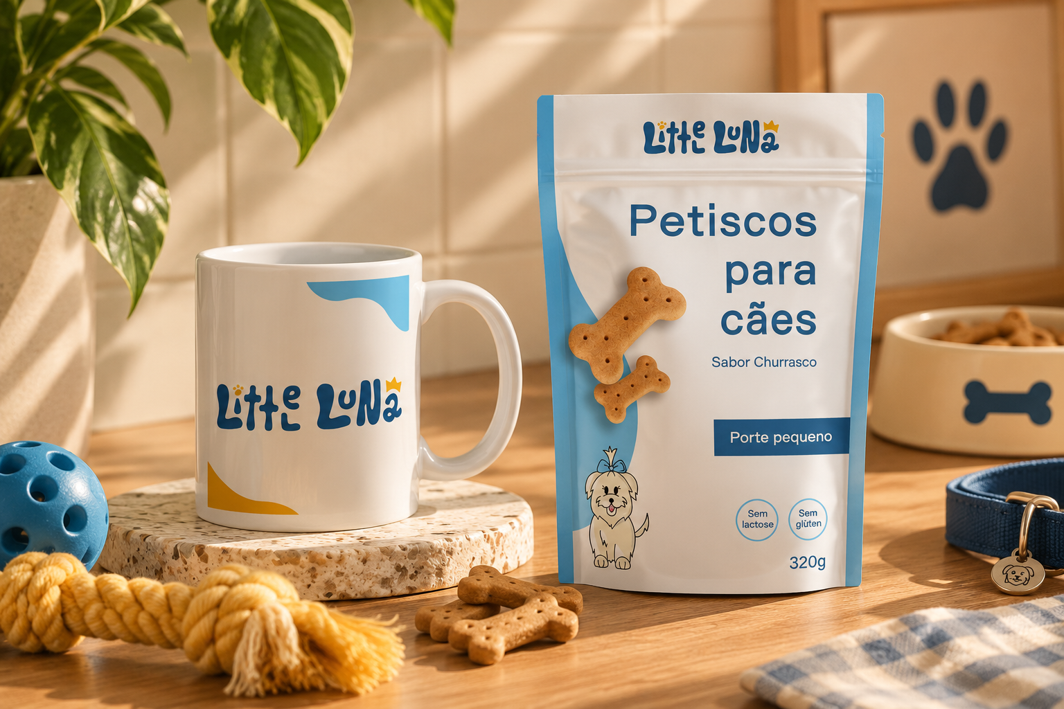
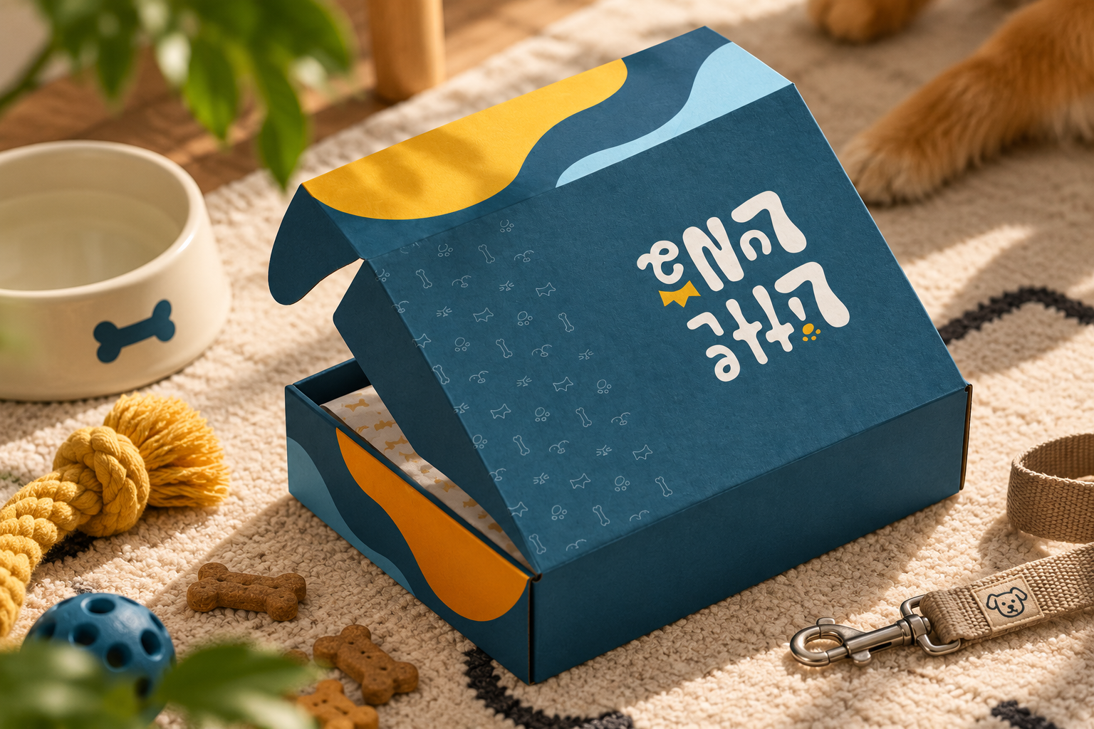
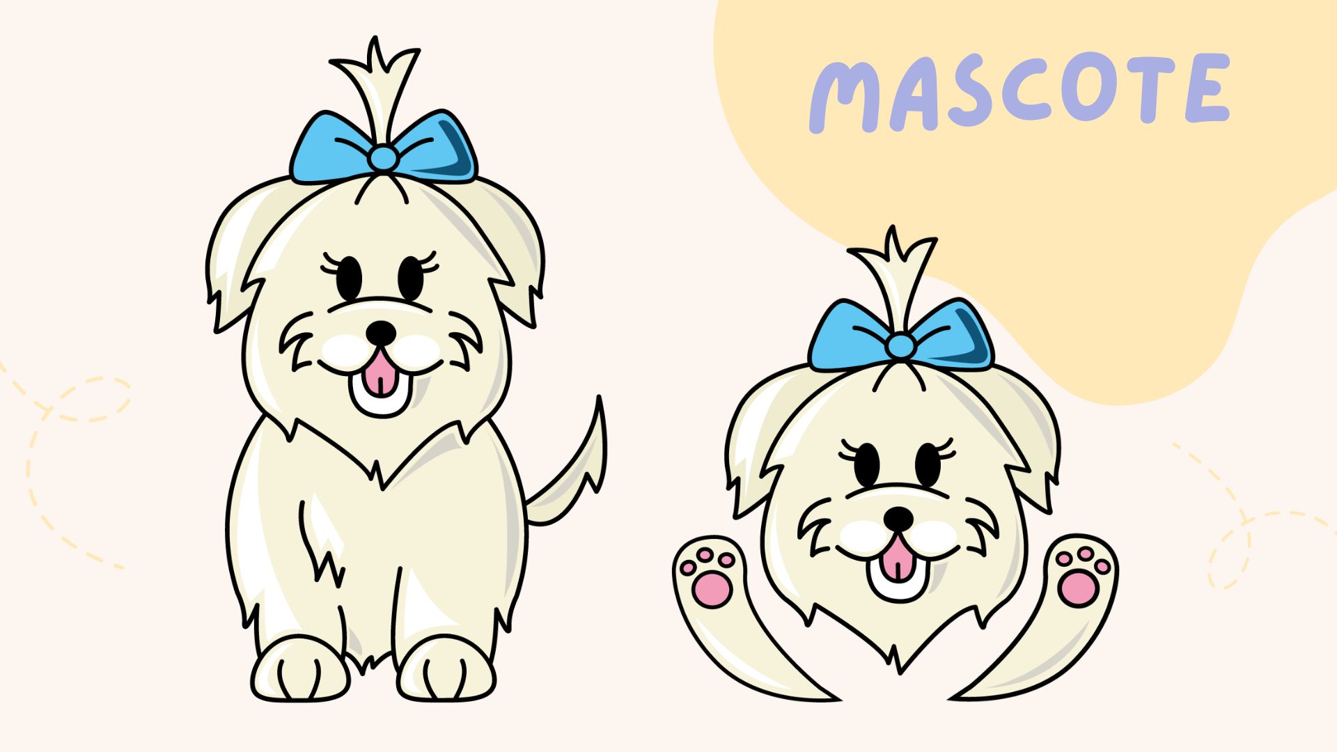
Little Luna is a pet product e-commerce concept built around the founder’s affection for dogs. The challenge was to look immediately recognizable as a pet brand while creating a distinctive identity that felt personal rather than generic. After briefing and competitor research, I developed a playful visual language using vibrant color, expressive typography, hand-drawn logo exploration, and a custom mascot. Organic curves and flowing lines were chosen to communicate the movement, energy, and softness associated with dogs. The identity extends into packaging and social media, with each application reinforcing the same warm, creative, human-centered personality.
Context & communication objective
Little Luna was conceived as an e-commerce store for pet products. The founder’s love for dogs was not a peripheral detail: it was meant to be felt throughout the brand. The central challenge was to balance category recognition with differentiation. Customers should immediately understand that this is a pet business, but also encounter a personality that feels affectionate, original, and memorable.
Research & strategic direction
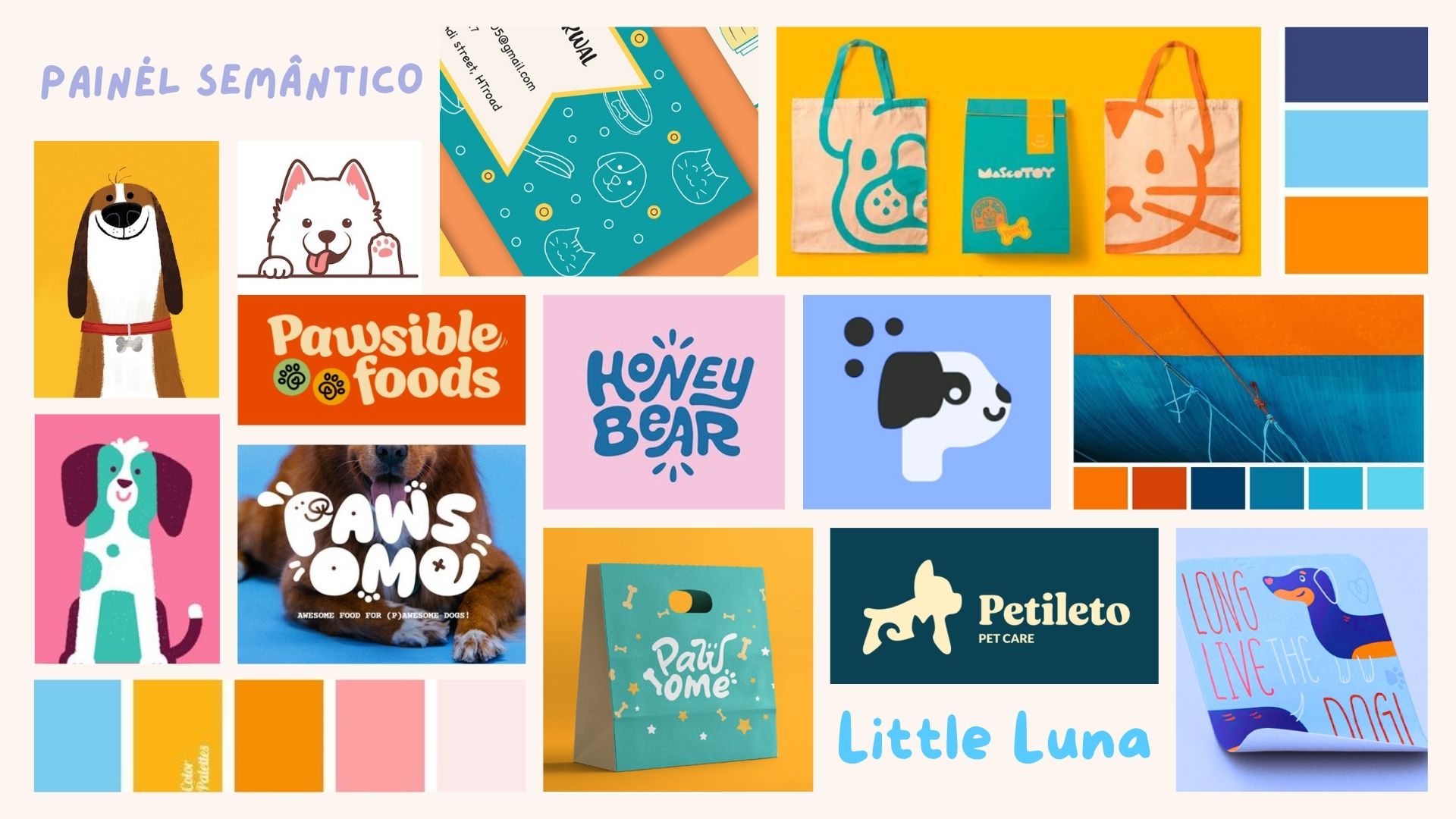
Following the briefing, I defined the desired tone of communication and studied competitor identities and common visual codes in the pet market. The strategic direction emphasized energy, creativity, and a human touch. Instead of treating a mascot as decoration added at the end, I approached the illustrated personality as a core part of how the brand would communicate its affection for animals.
Creative concept & design decisions
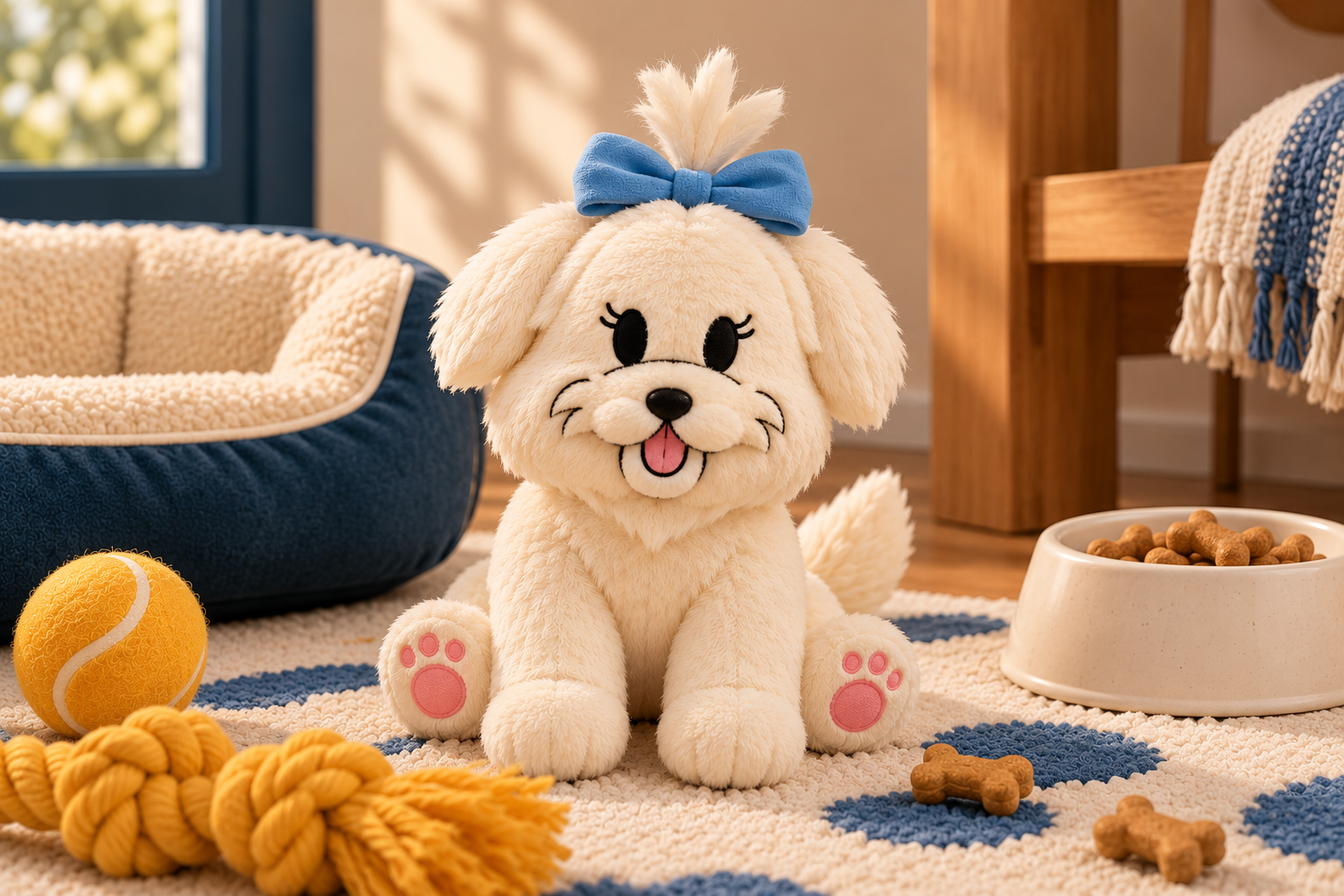
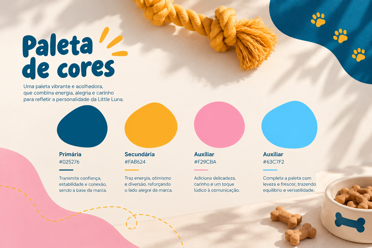
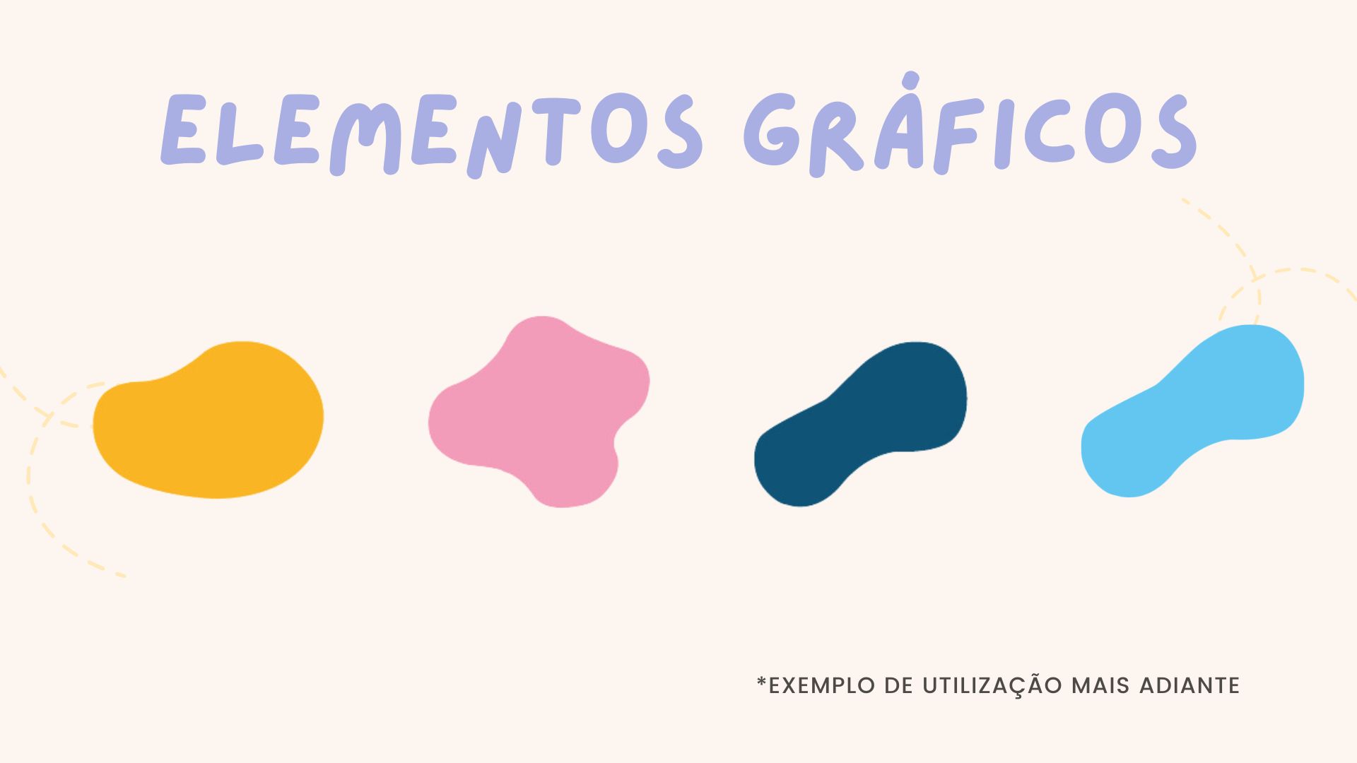
Both the initial logo and the mascot were drawn by hand. That choice was intentional: the imperfect, expressive character of drawn forms helped avoid an overly rigid or impersonal look. Curved lines and organic shapes were prioritized to suggest motion, the dynamism of dogs, and the softness of pet fur. Bright colors, playful typography, and recurring graphic details brought this concept into a cohesive visual language that could remain recognizable even when the logo was not the main element.
Applications & strategic considerations
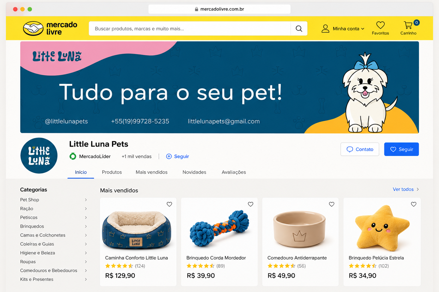
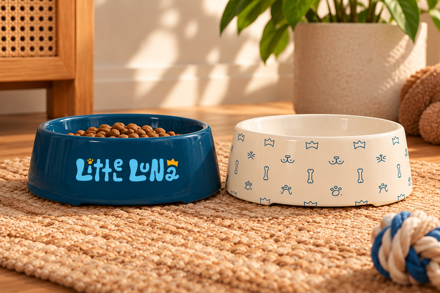
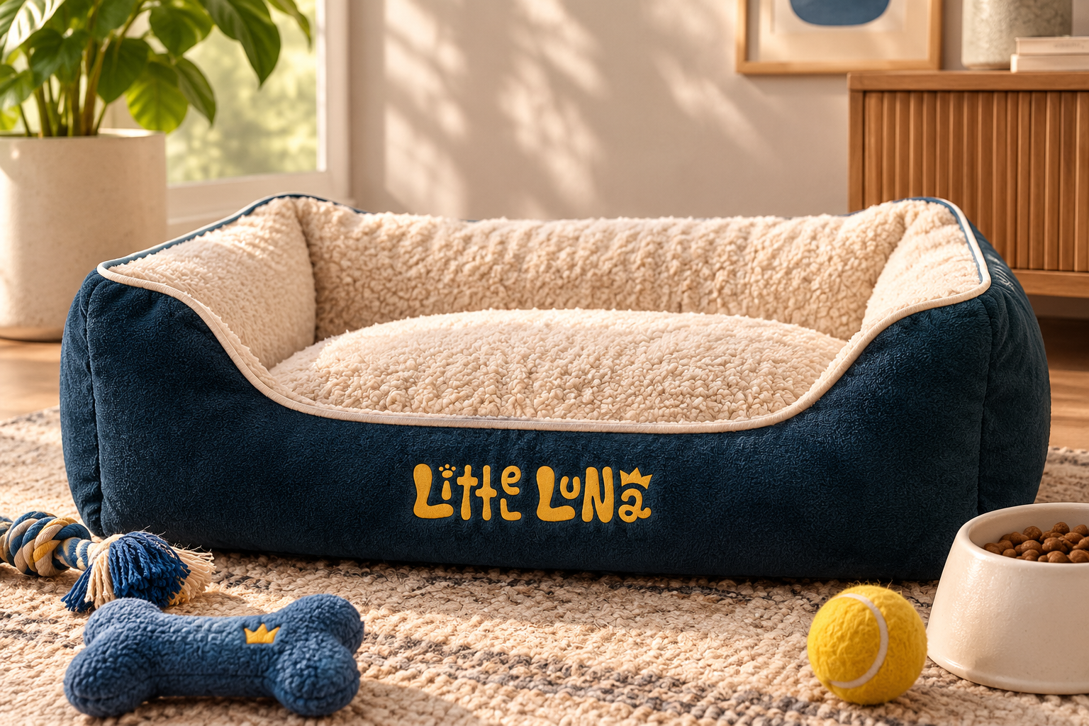
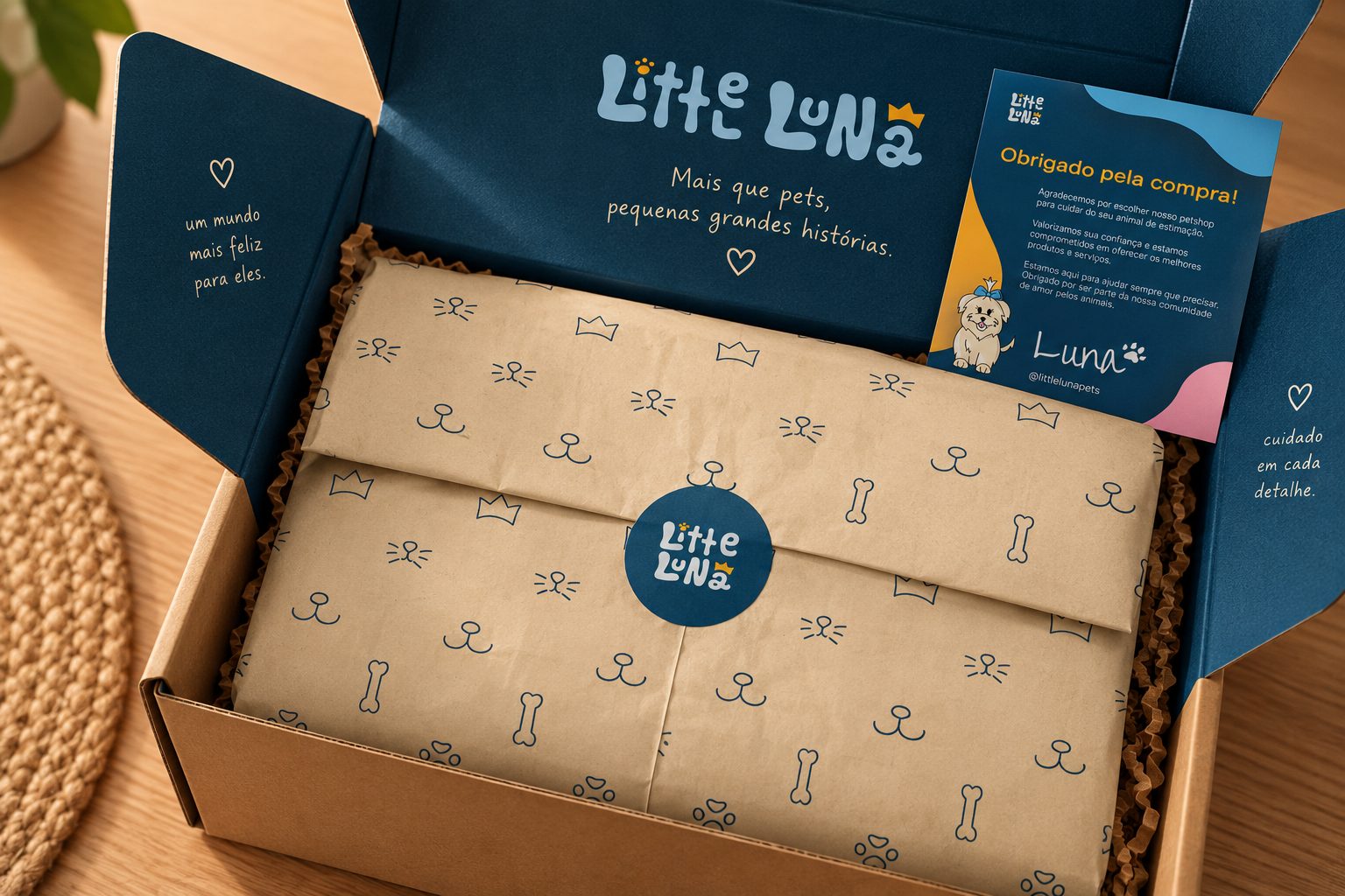
The visual system was applied to packaging, printed brand materials, illustrations, and social media content. This was especially useful for testing whether the identity could retain its character across very different touchpoints. My final strategic observations considered ways to build an engaging customer experience, increase memorability, and strengthen emotional connection through consistent illustration and storytelling. No customer response or sales impact is claimed as measured.
Visual archive / 14
Process & applications