Brand Identity · Case Study
Lulima
Introduction / Overview
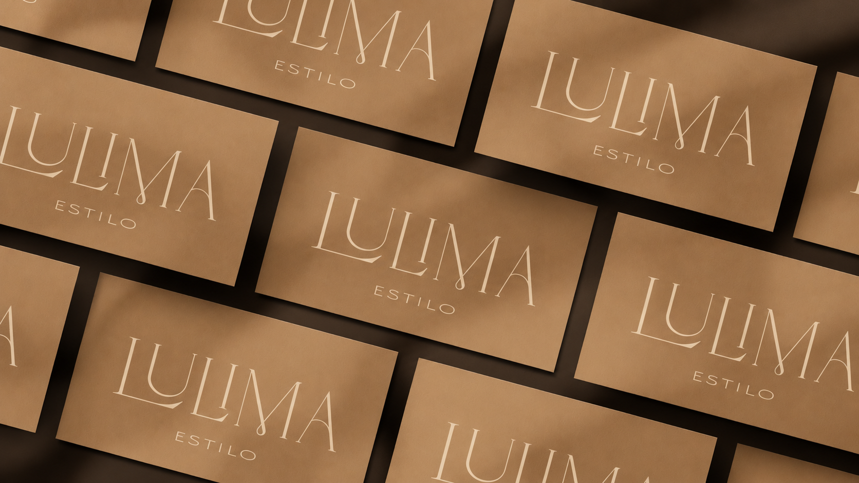
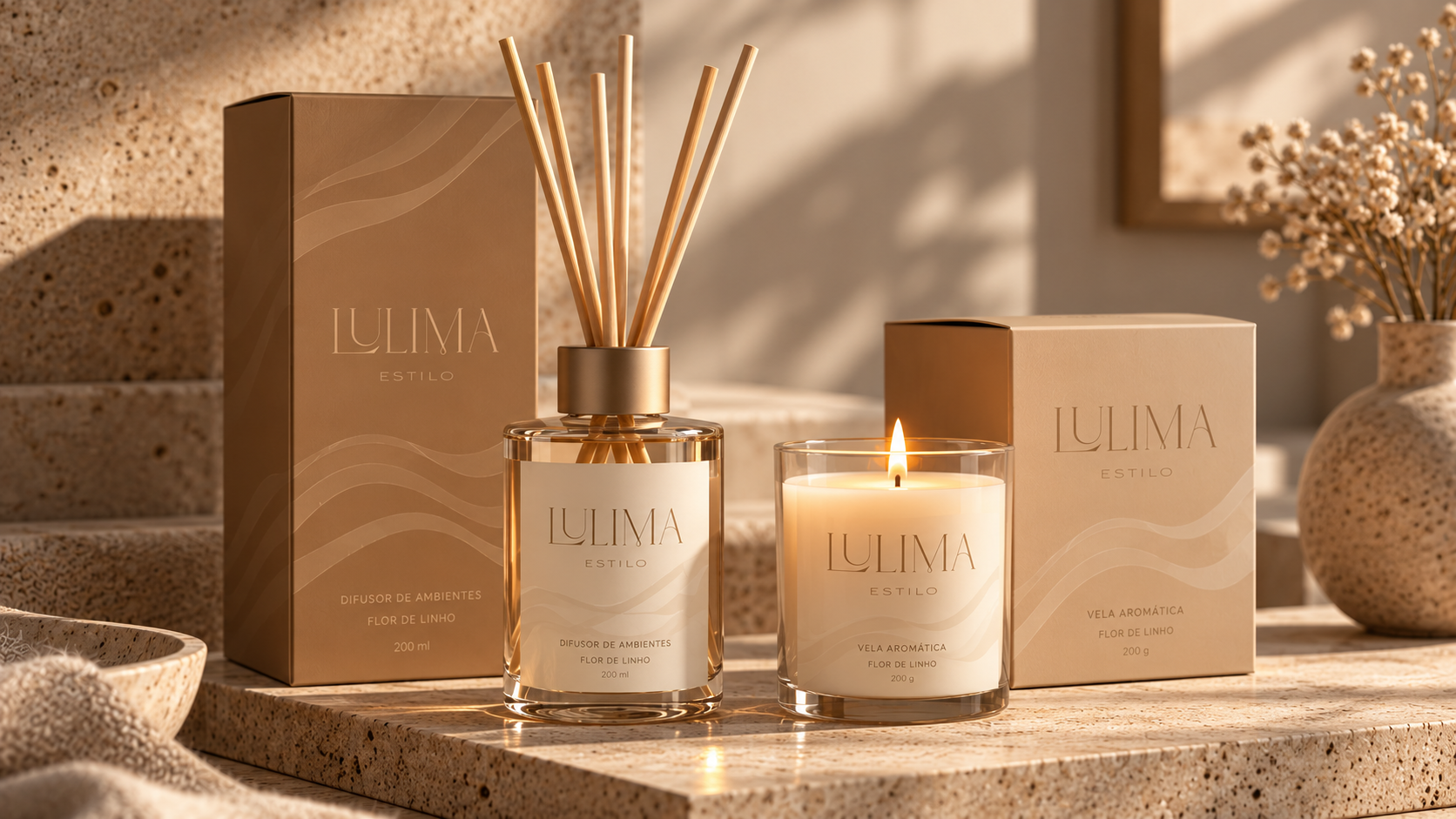
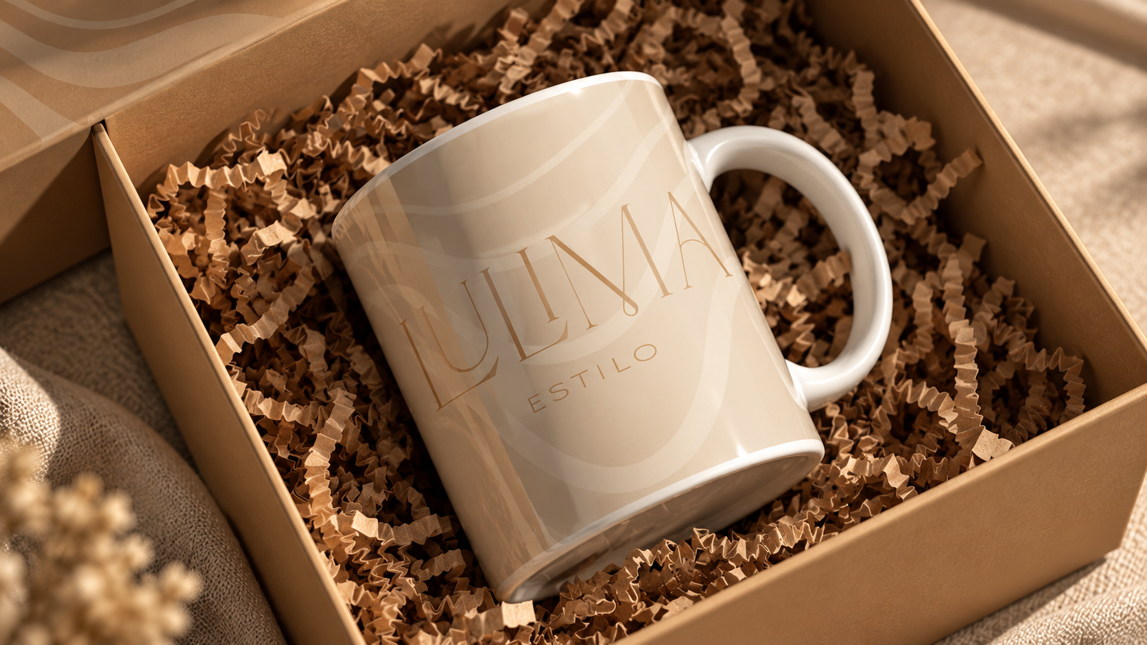
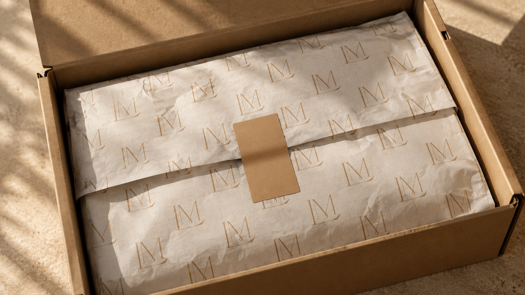
Lulima is a women’s fashion retailer whose rebranding aimed to support a move toward a higher-income audience, a more elevated product offer, and stronger perceived value. The challenge was to create a feminine identity that felt adult, delicate, confident, and original rather than simply decorative. Through market and competitor research, moodboards, sketches, and typographic exploration, I developed a warmer, more sophisticated palette influenced by luxury fashion references and the founder’s personality. Deliberate changes in letter scale and wave-like forms reference the curves of the female body, adding movement and individuality without losing elegance. The identity was translated into packaging and branded applications as a foundation for the retailer’s new positioning.
Context & communication objective
Lulima was a women’s clothing retailer seeking a new position in the market. The business wanted to reach customers with higher purchasing power, improve the quality of its product offering, and support a higher perceived and intended selling value. The rebranding therefore had to signal a meaningful shift in positioning. The desired brand personality combined authority, quality, confidence, and adult femininity, while retaining delicacy and originality.
Research & strategic direction
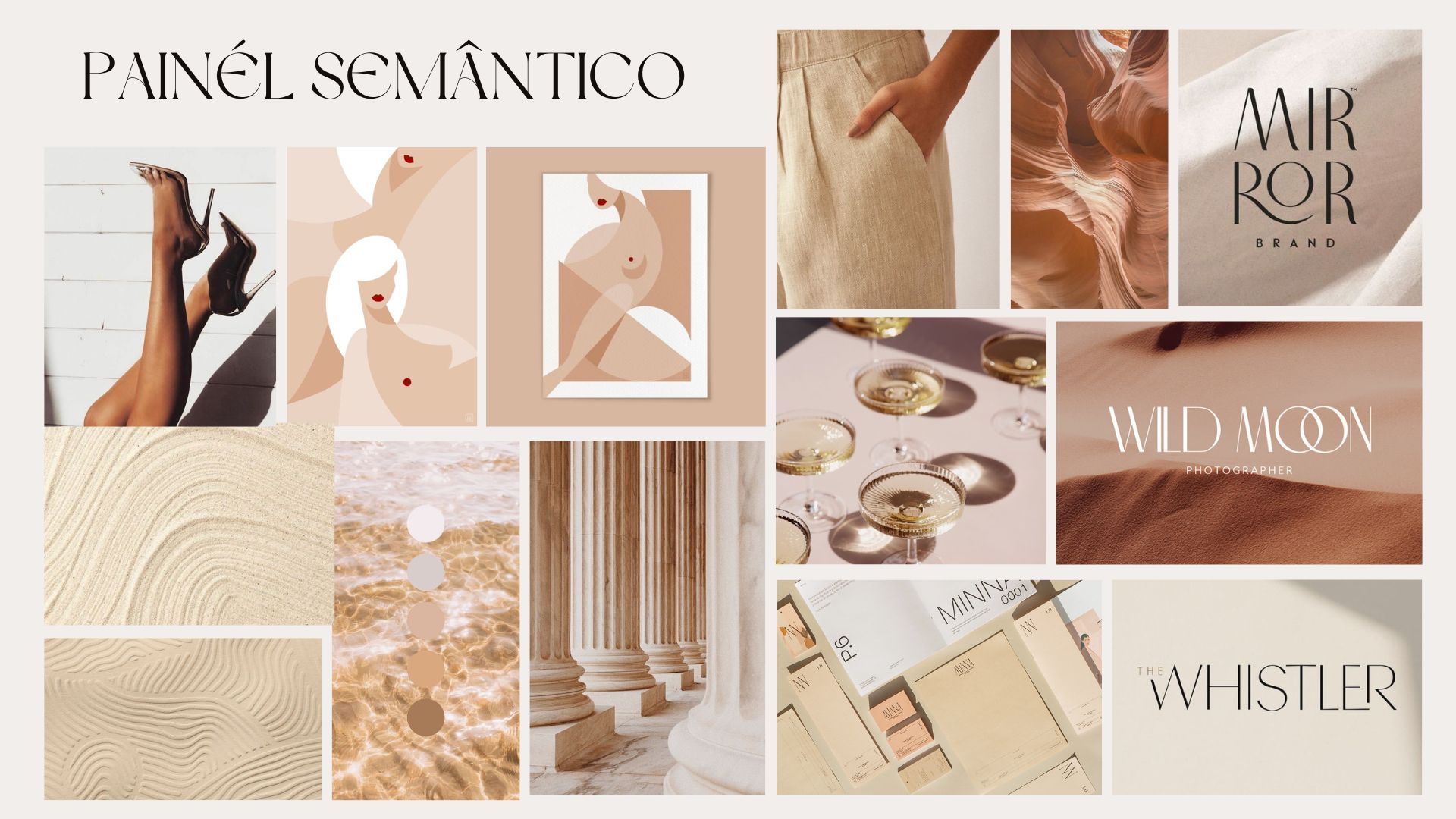
The work started with a briefing and the definition of brand objectives, followed by market research and analysis of competitors’ branding. Luxury fashion references, including the restrained and confident visual languages associated with established fashion houses, helped define the direction. I also considered the founder’s own image and personality so the new identity would not feel disconnected from the person behind the store.
Creative concept & design decisions
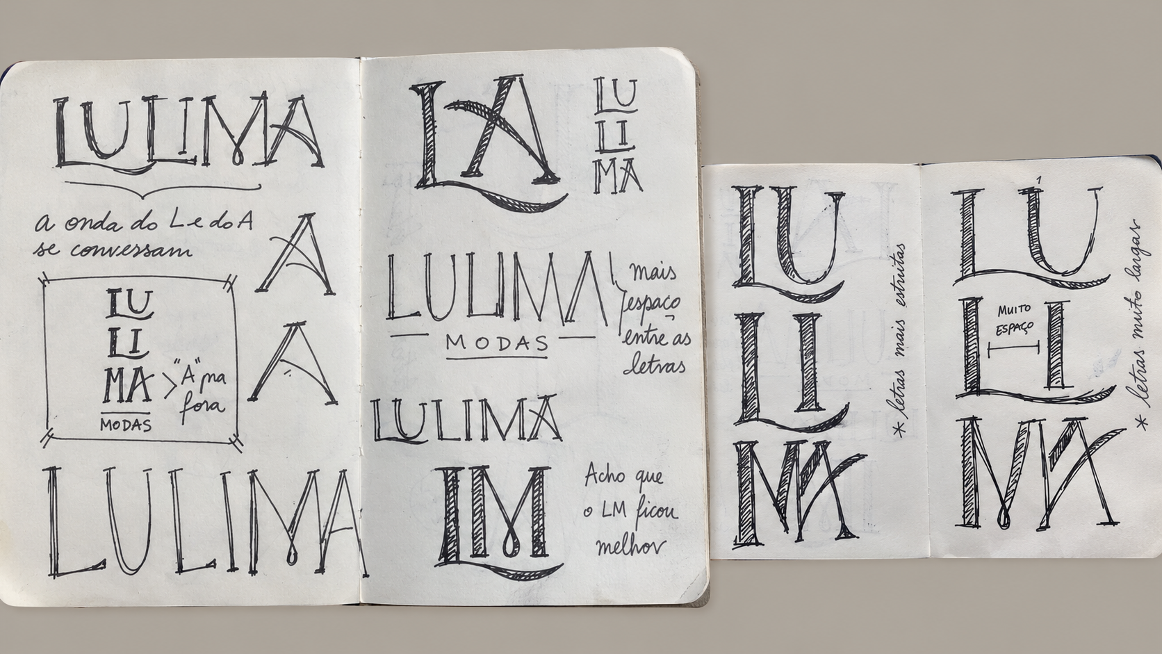
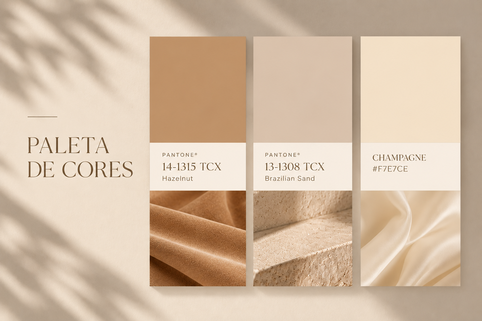
I introduced a palette of warm, sophisticated neutrals to replace the earlier visual direction and support a more elevated impression. Typography became the main expressive tool. Variations in the proportions and scale of letters, along with subtle wave-like details, were designed to reference the curves of a woman’s body. The intention was to bring movement and a recognizable signature into a restrained composition: feminine and delicate, but not youthful or generic. The logo was explored through sketches and type studies before the final visual system was developed.
Applications & strategic considerations
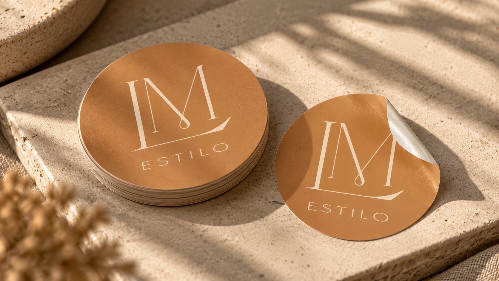
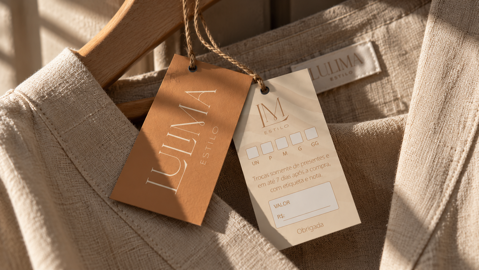
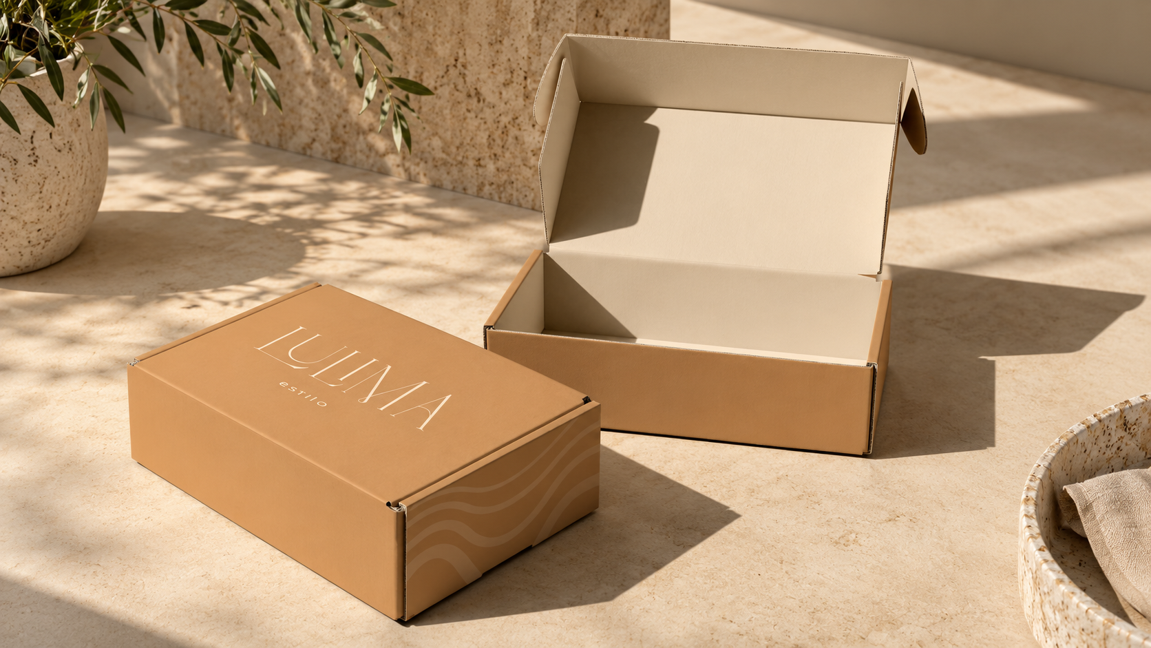
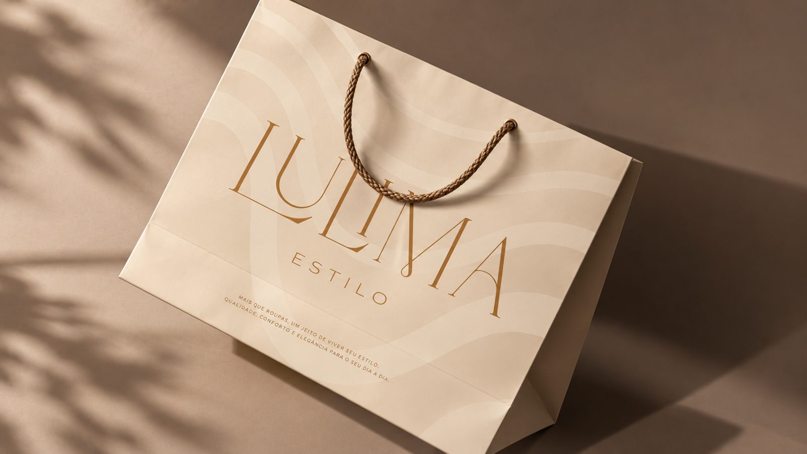
The new identity was presented across packaging, stationery, and other branded mockups. These applications illustrate how the visual language could remain consistent across customer touchpoints. The final strategic recommendations explored how presentation, customer experience, brand recall, and communication consistency could reinforce the intended premium positioning. They do not establish that higher sales or prices were achieved.
Visual archive / 10
Process & applications