Social Media · Case Study
Previato Fine Jewelry
Introduction / Overview
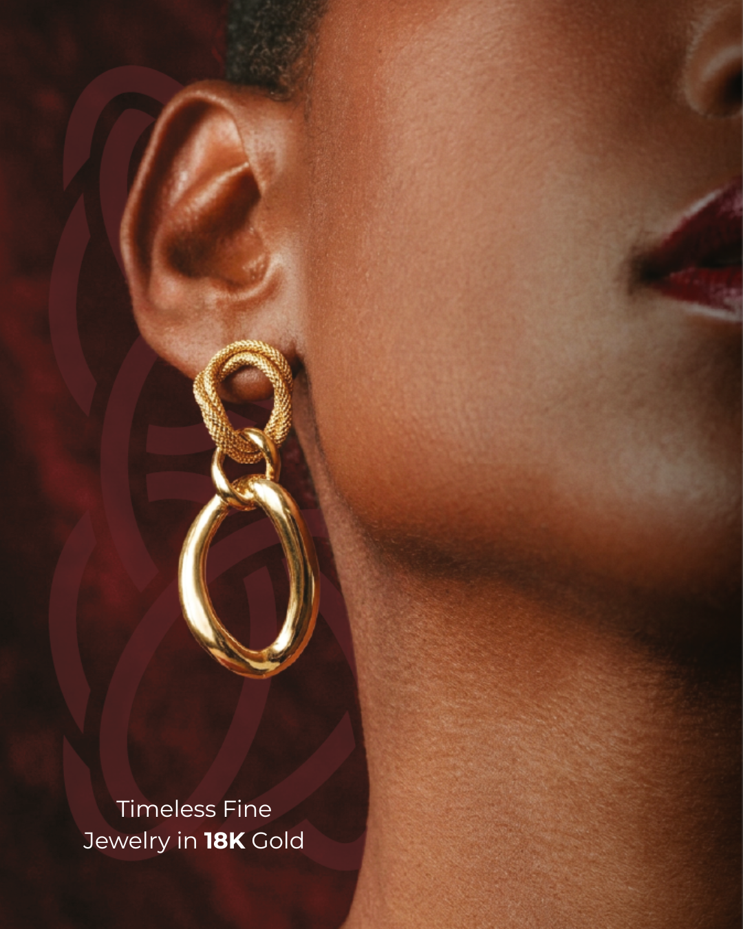
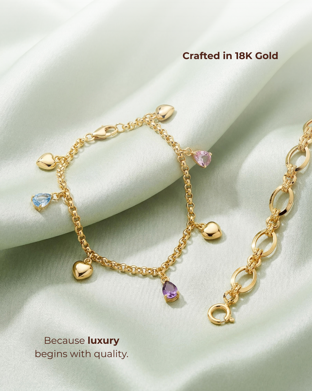
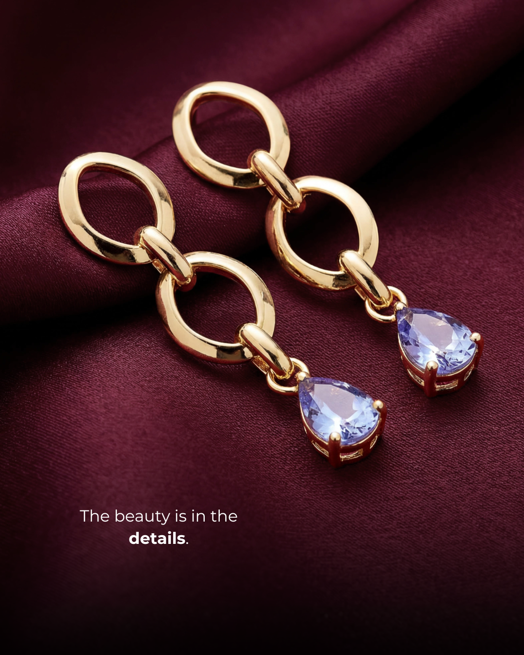
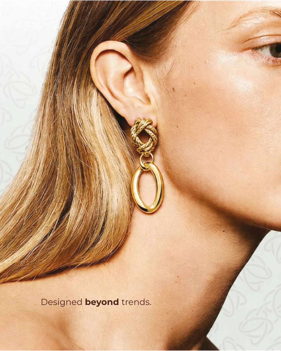
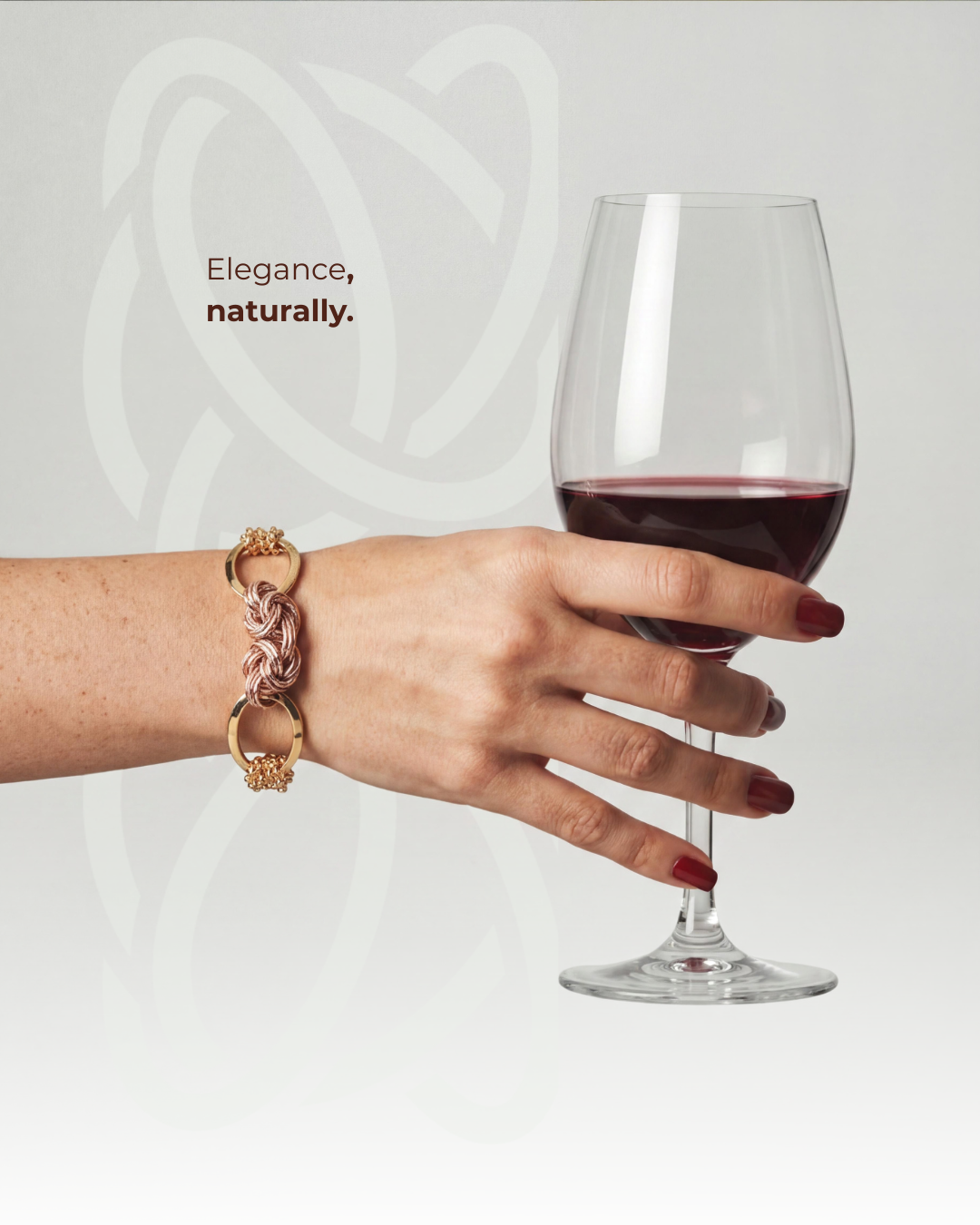
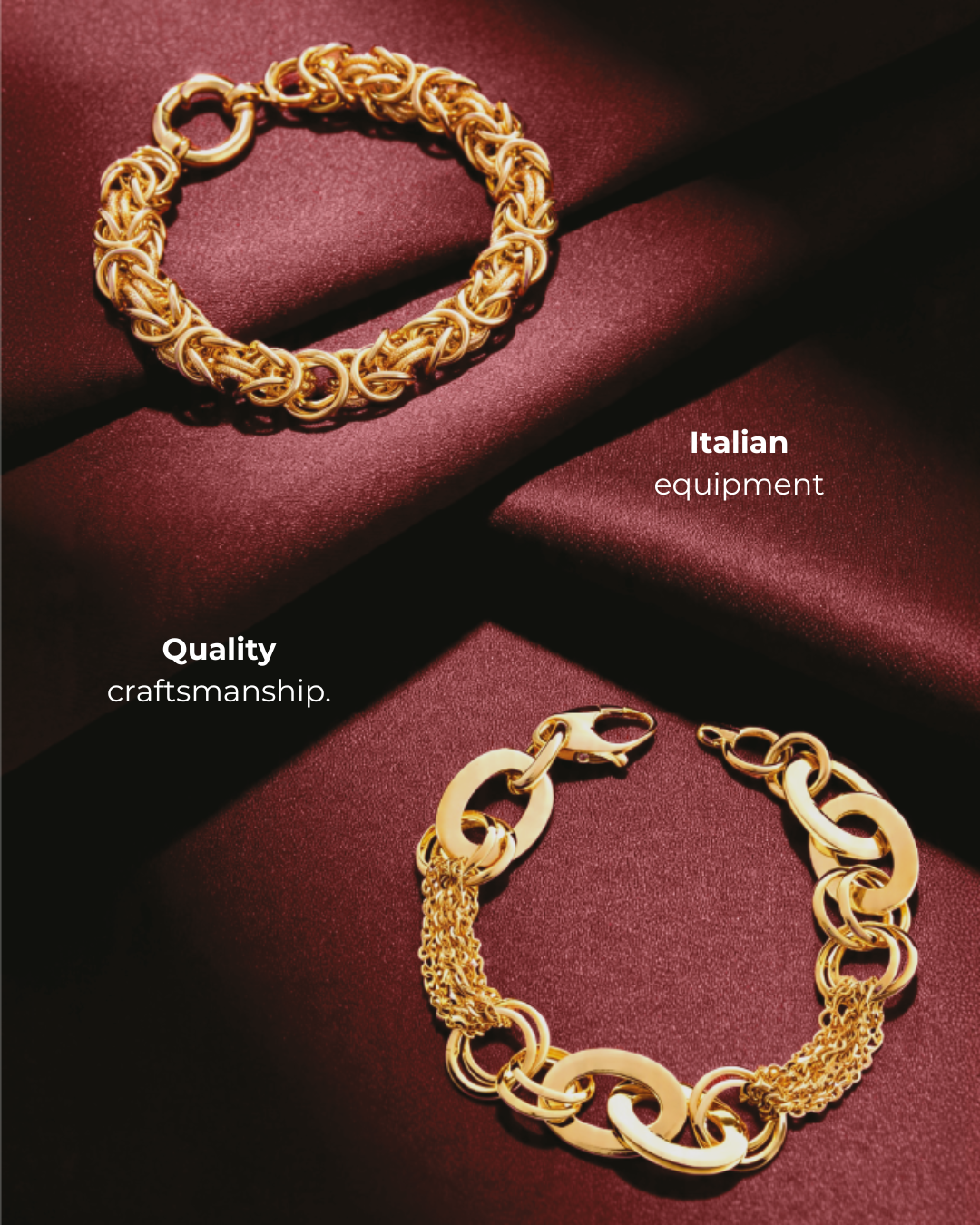
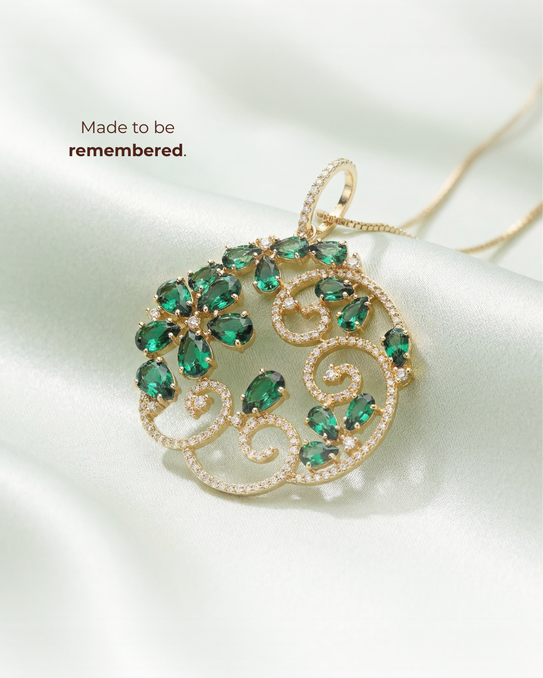
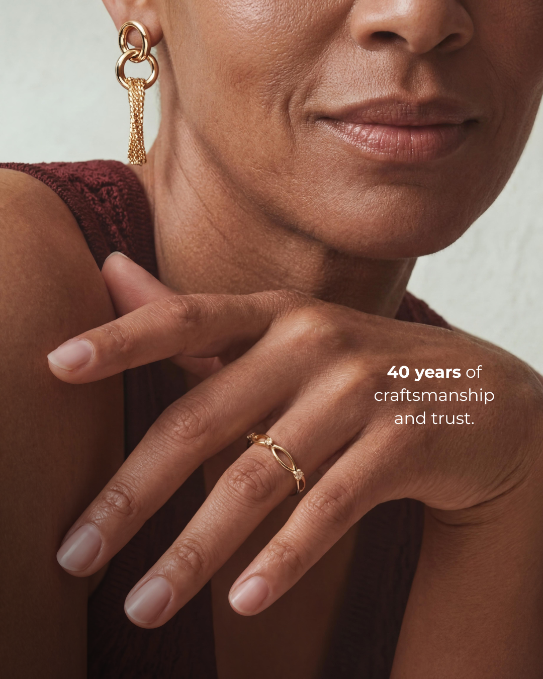
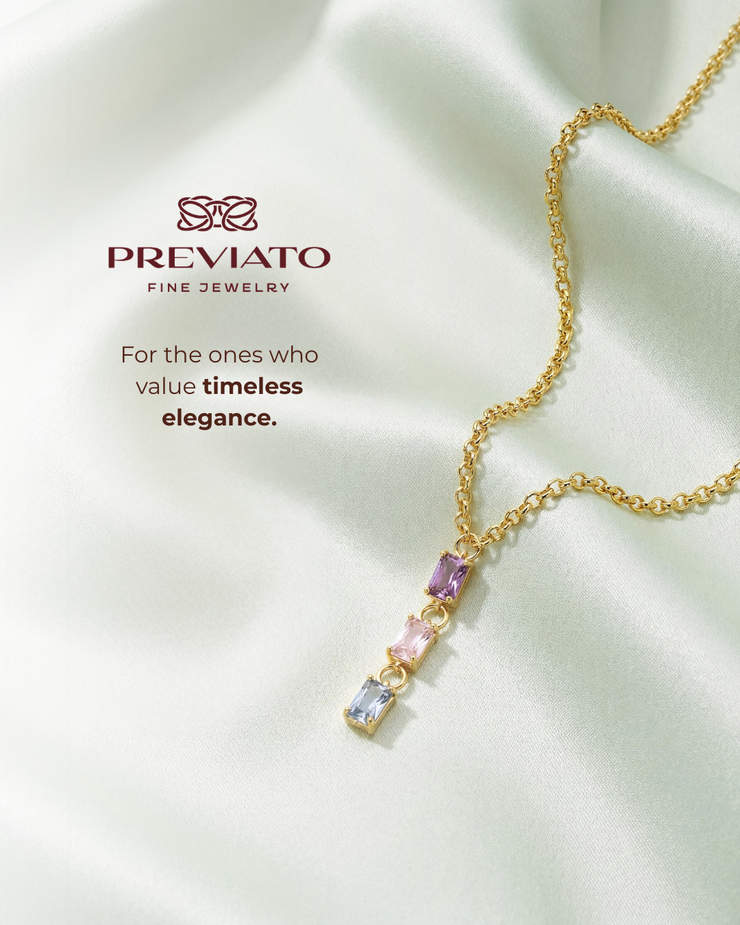
During a rebranding initiative for a US-based jewelry brand, I developed the visual direction for its digital communication. The objective was to express product quality, elegance, and mature femininity without relying on crowded compositions or promotional-looking branding. I intentionally photographed or presented the jewelry against softly folded silk: the material, sheen, and wave-like movement were selected to evoke delicacy and refinement while drawing attention to the pieces. Copy was kept sparse to create a quiet, editorial tone, and the logo appeared selectively or was integrated subtly into the layout. Inspired by the principles of quiet luxury, the approach uses visual restraint to make the products—not repeated brand marks—the center of attention.
Context & communication objective
Previato Fine Jewelry is a US-based jewelry brand that was undergoing a rebranding initiative. My responsibility was the visual communication for digital content, not the full brand identity or logo redesign. The aim was to communicate elegance, quality, and an adult sense of femininity, with the products themselves carrying the strongest visual message.
Creative concept & art direction
The project drew from the idea of quiet luxury: sophistication expressed through restraint, materials, composition, and detail rather than through loud promotional elements. The jewelry was placed against silk fabrics with deliberate folds and waves. Both the choice of silk and its movement were intentional, selected to echo softness, refinement, and the delicacy of the pieces. The folds also created depth and direction within otherwise minimal compositions.
Typography, copy & logo use
I deliberately used very little copy so that the eye would settle on the jewelry. The short lines of text contributed to a slightly mysterious, editorial tone instead of explaining everything immediately. The logo was also used sparingly or integrated into the design itself. The rationale was to avoid the visual repetition often associated with more overtly promotional communications and to support the premium perception sought by the brand. This is a creative positioning choice, not a universal claim that frequent logo use always lowers perceived value.
Applications & intended effect
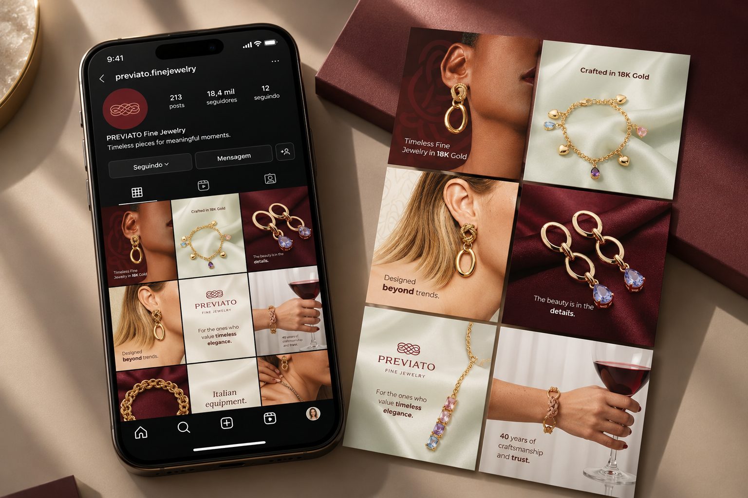
The resulting social media pieces work together as a restrained visual series. Consistent product photography, material choices, negative space, and typography support a recognizable digital language. The project demonstrates how content design and art direction can translate a rebranding objective into practical visual decisions; no engagement or sales metrics are asserted.
Visual archive / 09
Process & applications