Social Media · Case Study
Facta
Introduction / Overview
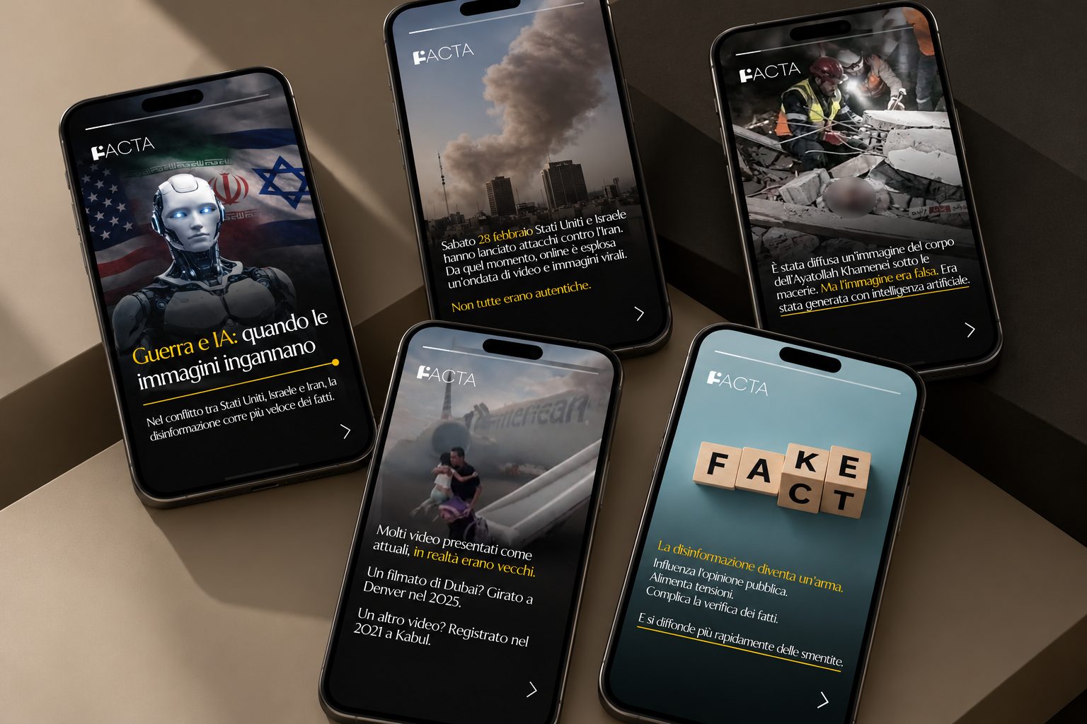
Facta is an Italian digital publication that identifies and debunks misinformation. Although its social media content already used the brand’s black-and-yellow palette, it lacked recurring graphic elements and a consistent editorial language. Rather than proposing an unnecessary full rebrand, I worked from the existing identity: I retained the established colors, introduced a circular graphic motif inspired by the dot within the F of the logo, and selected typography that complemented the original mark. The resulting content system was designed to bring visual continuity to posts on complex topics while making information hierarchy and readability central to the communication.
Context & communication objective
Facta is an Italian digital blog/publication dedicated to identifying and debunking fake news and misinformation. Its digital posts used the established brand colors but did not consistently carry recognizable graphic elements or a unified visual system. The design challenge was therefore one of coherence and extension, not creating a new brand from scratch.
Existing assets & visual research
I began by examining the existing visual identity and identifying which elements could become repeatable building blocks. Black and yellow were already familiar parts of the palette and were preserved. I also looked closely at the F in the existing logo, where a small circular detail offered a natural starting point for a graphic motif.
Design decisions & editorial system
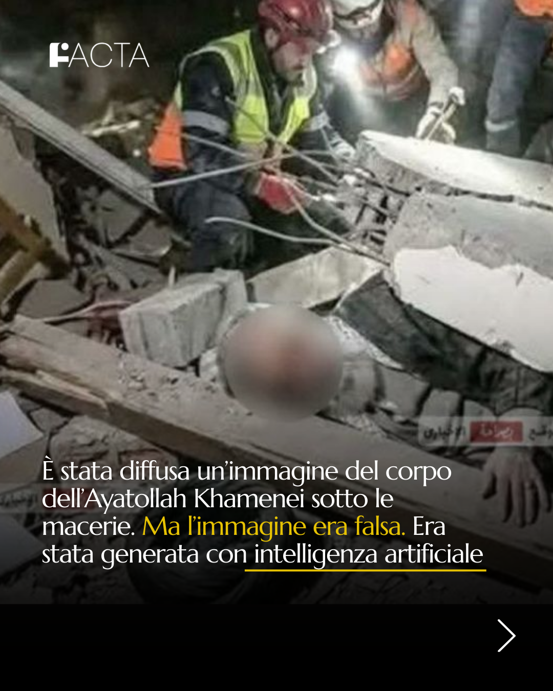
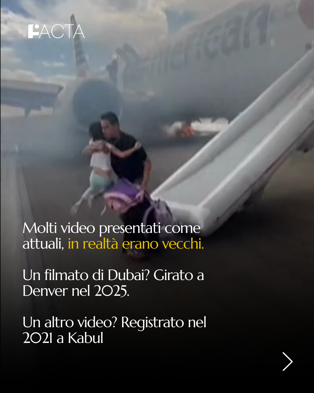
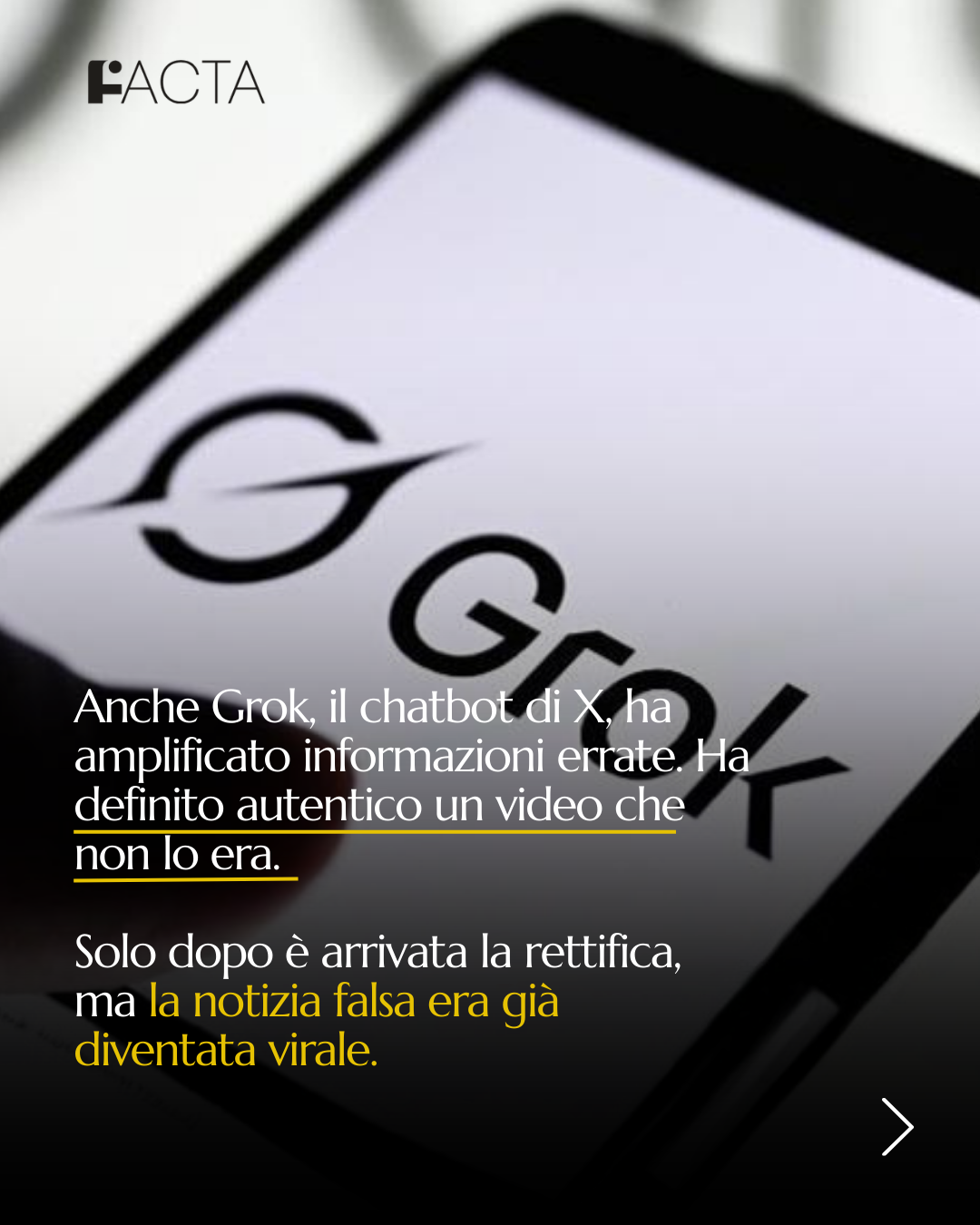
I developed the circle into a recurring element across the layouts, making a subtle connection to the original logo without needing to reproduce it prominently on every post. I selected a text typeface that harmonized with the logo typography and made the different pieces feel related. The combination of color, motif, type, and hierarchy aimed to give posts a homogeneous visual rhythm while keeping the subject matter legible.
Applications & intended effect
The design was applied to social posts dealing with misinformation and current affairs. It illustrates how an existing brand can be strengthened through a modest, well-reasoned visual system. The goal was greater recognition and clarity across formats; these are design intentions rather than verified audience-performance outcomes.
Visual archive / 07
Process & applications